April 2021
We have moved the news section of this website to Instagram. If you want to get information on our latest projects (and also on some past ones) please go to our new Instagram channel!
December 2020
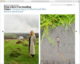
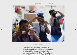
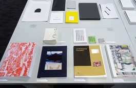
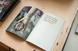
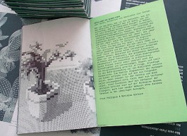
We are very happy to see our website design for From Where I’m Standing (the latest project by Empathy Museum) go live this week. 34 people across the UK, ranging from a midwife and a supermarket worker to an undertaker and an anaesthetist were asked to choose an object that has been important to them during lockdown and talk about their experience. The resulting website contains their portraits and stories. The launch will also coincide with a physical exhibition on Dalberg Road in Brixton from Thursday 10th December.
December 2020
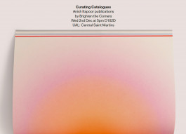
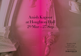
Designers are often expected to make things “beautiful” but what does this mean and who decides anyway? Can beauty be an objective in itself, or is the design process informed by something else entirely? This Wednesday 2nd December Billy will give a talk at Central Saint Martins (D102D at 5pm) in which he considers how a similar design process followed in projects for the same client (Anish Kapoor) has lead to very different outcomes – some of which you might even call beautiful.
December 2020
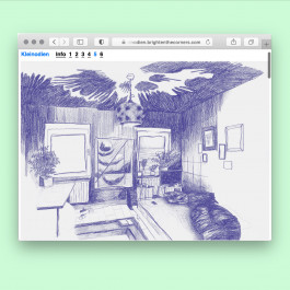
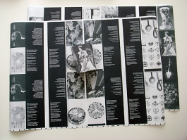
Kleinodien — 6 museums by 6 students of Frank at Darmstadt college (Fachbereich Gestaltung, Hochschule Darmstadt) produced over a period of 10 days in October 2020. Here the link to the museum website.
November 2020
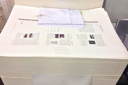
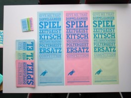
Lots of things in the pipeline but nothing out quite yet… we are currently working on a new website and identity for architectural practice Studio Syn; a publication to accompany Anish Kapoor’s exhibition of paintings at Modern Art Oxford; a soon-to-go-live website for Empathy Museum’s latest project (and travelling exhibition) ‘From Where I’m Standing’; and a book considering the role of method in architecture edited by Jan Silberberger to be published by gta Zürich. We also won another stamp design competition by the German Post Office / Bundesfinanzministerium. The stamp will be published in June 2021. More information on that to come soon.
July 2020
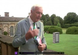
Here’s a screenshot of Channel 4 news presenter Jon Snow clutching our catalogue at the Anish Kapoor exhibition at Houghton Hall, which opens to the public this Sunday, July 12th (see news from February 2020). You can view the interview here and read the Guardian article here.
June 2020
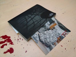
Many things have happened since and before April 2017 (see also our news features below from April 2019, December 2016 and October 2014) when we handed over our files of ‘Uluru and Kata Tjuta Photographs’ by Anish Kapoor to Steidl publishers in Göttingen. One of these many things is that it went into production and is finally out to see in the flesh (more info here). And that’s not all. Another Steidl publication (1188 pages) is due out this September. More info when it exists… To see more work we have done for Anish Kapoor, please visit our portfolio.
May 2020
We have recently designed the visual identity and website for Same River (formerly Boz Temple-Morris), a company offering storytelling for a wide range of organisations including Accenture, Microsoft, Lenovo and BBC. For more information visit www.sameriver.co.uk
May 2020
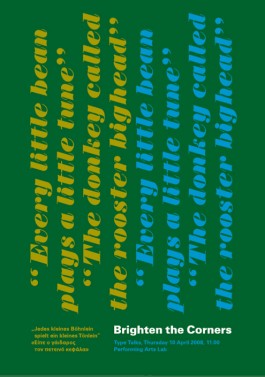
Two blogs for courses run by Frank at Darmstadt college (Fachbereich Gestaltung, Hochschule Darmstadt) in the Corona summer semester 2020: www.letsplay.brightenthecorners.com, www.turnturnturn.brightenthecorners.com
April 2020
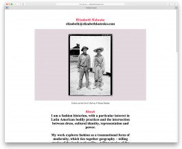
Our mini website for fashion historian, author and lecturer Elizabeth Kutesko has just gone live. Visit elizabethkutesko.com for more.
February 2020
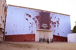
Since last week we have been working on the marketing material for the upcoming Anish Kapoor exhibition at Houghton Hall which runs from March 29 to September 27. The graphic identity plays with the presence of Anish Kapoor’s mirrors in the house’s Stone Hall and will include magazine ads, billboards, leaflets and the exhibition booklet. Due to the fast approaching publication deadlines, the first ad was already sent out this morning. To see more work we have done for Anish Kapoor, please visit our portfolio.
February 2020
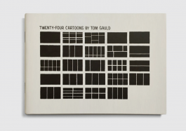
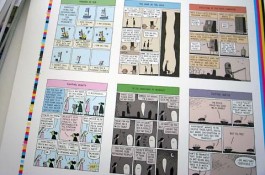
We designed a small collection of Guardian cartoons by Tom Gauld. It is a postcard-size booklet, twenty-four pages, stapled. You can buy it here. To see more work we have done for Tom Gauld, please visit our portfolio.
February 2020
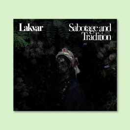
‘Sabotage and Tradition’, the CD we designed for Lakvar (contemporary folk music from eastern Europe), is out. The release concert and party is on the 27th of February in the Laboratorium in Stuttgart.
November 2019
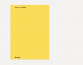
‘Product’, the book we designed for Tim Mitchell and which was published by Kerber has made it on the shortlist of the German Photobook Award 2019. To see more work we have done for Tim Mitchell, please visit our portfolio.
September 2019
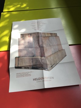
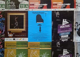
Flyer-poster-programme for a joint venture between the 3 theatres Staatstheater Darmstadt, Mousonturm Frankfurt and the Alte Oper Frankfurt on the topic of heroes (or rather the end of them…).
August 2019
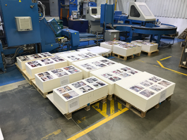
After much digital and analogue editing, we have sent the 360-page photographic publication ‘Product’ to print. The book, published by Kerber, is the first monograph of photographer Tim Mitchell, and will accompany his exhibition at the Northern Gallery for Contemporary Art from 31 August to 9 November 2019.
June 2019
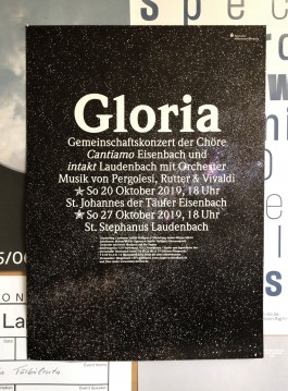
Gloria – design of posters, flyer, tickets, etc. for a choir concert with music by Vivaldi, Pergolesi and Rutter in two different churches (St. Johannes der Täufer and St. Stephanus) near the city of Obernburg am Main in Bavaria in October 2019.
May 2019
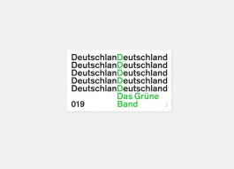
Our typographic stamp design for ‘Das Grüne Band Deutschland’ won 2nd place in the invited competition by the Bundesfinanzministerium (Referat Postwertzeichen). We are being invited to competitions since 2003. For more information and images see also our portfolio of work. To see more stamp work we have done please visit our portfolio.
April 2019
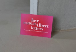
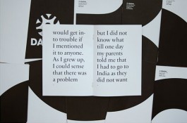
A new job for an old client (designed from our very new studio in Deptford). The latest DAAD/IMLR German Writing Competition 2019, is inspired by the love letters of Queen Victoria and her husband Albert. The deadline for submission is Wednesday, 15 May 2019. More information on the competition here.
April 2019
After a mere 8 years (see also our news entry further down from October 2014) in the making (and a considerable amount of colour proofing), it seems that our epic, 1,184 pages of Anish Kapoor’s architectural drawings, models, renders, plans, and photos of the final works inlcuding their installation may be printed, bound and sent to bookshops in time for the summer. More information on the two-volume publication, ‘Make New Space – Architectural Projects by Anish Kapoor’, can be found on the publisher’s website, Steidl. To see more work we have done for Anish Kapoor, please visit our portfolio.
April 2019
After a mere 5 years (see also our news entry further down from October 2014) in the making (and a considerable amount of colour proofing), it seems that our epic, 752 pages of Anish Kapoor’s photographs from Uluru and Kata Tjuta may be printed, bound and sent to bookshops in time for the summer. More information on the two-volume publication, ‘Uluru & Kata Tjuta photographs by Anish Kapoor’, can be found on the publisher’s website, Steidl. To see more work we have done for Anish Kapoor, please visit our portfolio.
February 2019
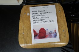
Just in time for the closing of the exhibition of Anish Kapoor at the Serralves museum in Porto, Portugal, on February 17th (yes, the show were a man was injured during an ‘art accident’) we finally have the printed catalogue we designed in the spring/summer of 2018 in our hands (on our chairs). We don’t really know what took the printer so long, nor do we know why the catalogue isn’t anywhere in shops yet. But we do know, that the special thing about this catalogue is, that it gives a very close insight in the way Anish Kapoor works in his studio, starting in 1975 up to 2018. To see more work we have done for Anish Kapoor, please visit our portfolio.
January 2019
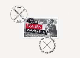
We designed the stamp and the first day cover stamps for 100 Jahre Frauenwahlrecht (100 Years Women’s Suffrage in Germany). The historical image, in conjunction with the typography, reflects the struggle for equality of women at the end of the 18th and beginning of the 19th century (until today). An example of this struggle is Marie Juchacz, the first speaker in front of a German parliament, after women’s suffrage was won. The photo shows her in 1919 during a speech in front of a crowd in Berlin. The typographical treatment serves also as a reference and hommage to the contemporary American (feminist) artist Barbara Kruger, and to Aleksander Rodchenko, the Russian artist, sculptor, photographer and graphic designer who played a vital role during the Russian October Revolution in 1917 which had a great influence on the German November Revolution in 1918, which finally brought the women right to vote to Germany. Buy the stamp here. To see more stamp work we have done, please visit our portfolio.
November 2018
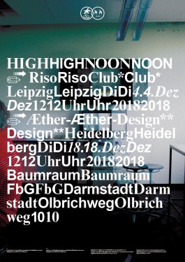
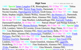
We designed the poster (A1, offset) for the regular High Noon talks at the Faculty of Design (FbG) in Darmstadt. The topic during this winter season is ‘FbG design partnerships’. The first talk with Riso Club from Leipzig (Christiane Haas & Sina Schindler, faculty alumna from 2013) is on the 4th of December and the second talk with Aether-Design from Heidelberg (Lukas Breitkreuz & Max Hathaway, faculty alumni from 2008) is on the 18th December 2018. To see more work we have done for the Faculty of Design, please visit our portfolio.
November 2018
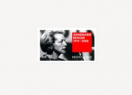
Our stamp design for ‘Annemarie Renger 1919–2008’ won 3rd place in the invited competition by the Bundesfinanzministerium (Referat Postwertzeichen). We are being invited to competitions since 2003. For more information and images see also our portfolio of work.
November 2018
(Animated and printed) posters and flyers Frank’s students (Marvin Backes, Yannik Gedaschke, Alexander Kueller, Yannic Merz, Janik Sam) in Darmstadt designed for the High Noon talk of Raw Color (NL) on November 7th at the Faculty of Design.
Oktober 2018
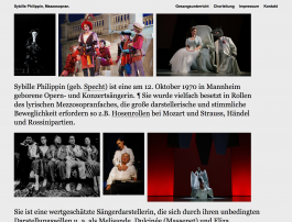
Micro website for Sybille Philippin, mezzo-soprano – an opera and concert singer.
Oktober 2018
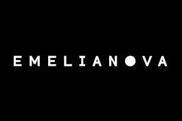
Visual Identity incl. logo and name for Milan-based Ksenia Emelianova, a Russian-born artist and interior designer. Micro-website to follow soon.
Oktober 2018
New micro website for ‘High Noon’ – a series of talks Frank organises at the Faculty of Design at Darmstadt University since 2008.
Oktober 2018
We have a new website. It’s our 5th site since we started the studio in 1999. If you are interested in the past you can click on the following links to see our first website from the year 2001–2004, our second one from 2005–2009, our third from 2010–2015 and our fourth from 2016–2018. Our new site is running on WordPress with Lay Theme and is our first site (apart from our very first site) were we haven’t used a programmer but do it all ourselves…
August 2018
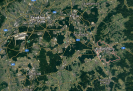
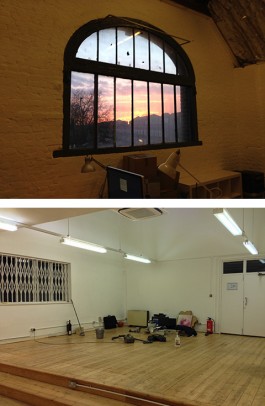
The German studio of Brighten the Corners moved to the center of the Bavarian city of Aschaffenburg – close to Frankfurt/Main. Please go to our Info page for the full address.
August 2018
Our most recent book for Anish Kapoor’s exhibition in Serralves, Porto goes to print. All sections are printed except one – now, if we can only get a decision on those logo sizes on the cover and imprint pages… To see more work we have done for Anish Kapoor, please visit our portfolio.

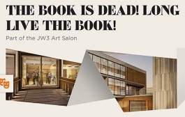
This Tuesday, February 16th, Billy will be at JW3 (London Jewish Cultural Centre) to take part in ‘The Book is Dead! Long Live the Book!’ a discussion about changes in the publishing industry and how they are affecting the book as an object. He will be joined by artist Sophie Herxheimer, Hebrew calligrapher and Torah scribe Josh Baum, and graphic novelist Simone Lia who will talk to artist Jacqueline Nicholls about their work. You can book tickets here.
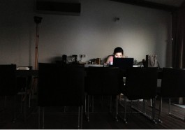
Frank just came back from Düsseldorf, where he was a guest-critic (looking and giving comments to over 100 (!) student works). He was invited by Andreas Uebele, who is teaching at the Peter Behrens School of Arts there. Frank also gave a talk at the end of a (very) long and enjoyable day. The event took place at the Filmwerkstatt Düsseldorf. The co-critics were Susanne Stahl from Berlin based studio Stahl R and Peter Zizka from Frankfurt/Berlin based Heine/Lenz/Zizka. (Photo: Jan Barthel)
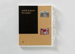
We are very pleased to hear that our catalogue design for Anish Kapoor’s exhibition at the gardens of Versailles, has been awarded as Excellent Work at the 2016 Tokyo TDC (Type Directors Club) Awards in Japan.
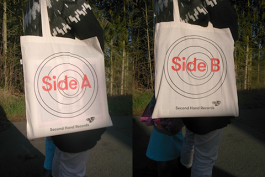
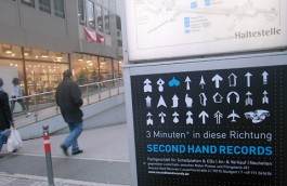
A new bag for Second Hand Records store in Stuttgart for all who (still or came back to) love vinyl.
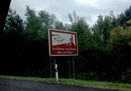
This week we went to Weil am Rhein for a meeting at the Vitra Design Museum. We are currently working for them on the catalogue for an exhibition about the life and work of Alexander Girard which will open in March 2016. Alexander Girard was an architect, interior designer, furniture designer, industrial designer, textile designer and graphic designer. He was also a collector of folk art. The show is the first major retrospective about his work and collection.
We have just returned from Russia, where we oversaw the production of ‘My Red Homeland’ the bi-lingual catalogue accompanying the exhibition of Anish Kapoor at the Jewish Museum & Tolerance Center in Moscow. The exhibition will run from the 22nd September 2015 until 17th Januray 2016.
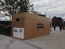
The finishing touches have been applied, and ‘a Mile in my Shoes’ is now open to the public from today, 4 September until 27 September 2015. You can visit to hear strangers’ stories and walk in their shoes from 12.00 pm to 6.00 pm, Wednesday to Sunday, at Riverside Gardens, Nine Elms Lane, Vauxhall London SW8 2DU.
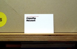
We have recently designed the identity of the world’s first Empathy Museum, and are currently working on the design for its launch event, ‘A Mile in my Shoes’. The event is an audio portrait of Wandsworth, housed in a theatrical shoe shop, where visitors literally walk in the shoes of a stranger. ‘A Mile in my Shoes’ is open 4–27 September 2015, 12.00 pm–6.00 pm, Wednesday to Sunday, at Riverside Gardens, Nine Elms Lane, Vauxhall London SW8 2DU.
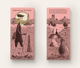
Tom Gauld’s ‘Endless Journey’ a myriorama inspired by the works of Laurence Sterne, has just come back from the printers. The pack consists of twelve picture cards that can be arranged to form 479,001,600 different landscapes. It was commissioned by The Laurence Sterne Trust with support by Arts Council England on them occasion of the ‘Sentimental Landscapes’ exhibition at Shandy Hall in North Yorkshire. You can buy ‘Endless Journey’ here, and read more about it on It’s Nice That.
Frank will be giving a talk at Peter Behrens School of Arts in Düsseldorf on June 9th. Holger from mind design, who is teaching there, has invited us. Looking forward to seeing him and his students and to a hopefully nice day & night in Düsseldorf.
The latest poster we designed for Second Hand Records shop in Stuttgart is an A to Z of record covers. Each customer will get one for free when purchasing an item in the shop.
On International Labour Day May 1st we travelled out to Falmouth University in Cornwall to give a talk and tutorials to students in the The School of Communication Design.
We’re pleased to announce that on Thursday April 30th, we will be joining the ever growing list of speakers at the Typographic Circle. Our talk will start at 7:00pm at the St Bride Library, 14 Bride Lane, London EC4Y 8EQ. Previous speakers include Alan Kitching, Stefan Sagmeister, Ken Garland, Jonathan Barnbrook, and Simon Esterson among others. For a full list of speakers and an archive of their posters visit the Typographic Circle poster archive. To book tickets and for a glimpse of our poster please click here.
Brighten the Corners has been selected to be part of this year’s Book Design Jury during D&AD Judging Week 2015 at the Old Truman Brewery in East London. The Judging Week will feature a full programme of events and runs from 19 to 23 April. For more information, please click here.
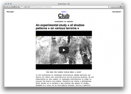
Join the Club! Anah-Club, a website we designed for Berlin and Salzburg based Anah architects is online now. Thanks to Fabian Wohlfart for the coding.
It’s Nice That asked us for our favourite books on our bookshelves. We were happy to share this information with them (and now with you). Happy reading!
Lots of ink on good papers at the Stationers’ Hall in London for this year’s Fedrigoni Top Awards. We are also happy to have received second prize in the Books category for Symphony for a Beloved Sun. All winning work was on show between March 10–13, 2015.
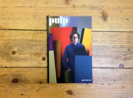
We have just received the latest issue of Pulp, a quarterly journal created by Eye Magazine for Fedrigoni and designed by Holly Catford and Simon Esterson. It features an interview we had with John L Walters about our work for artist Anish Kapoor over the last few years. Follow this link to get your copy.
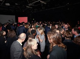
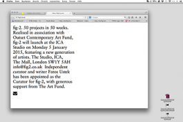
We are very happy that fig-2 has launched this week, for which we have designed the graphic identity and website www.fig2.co.uk. Many thanks to David Miller for the programming. fig-2 (organised in association with Outset) is a year-long exhibition featuring 50 projects over 50 weeks at the ICA Studio and is being curated by Art Fund curator, Fatoş Üstek. Week 1/50 featured artist Laura Eldret and was followed by a launch party at the ICA (see photograph by Sylvain Deleu). Week 2/50 opens on Monday 12 January with artist Charles Avery. More artists will be announced on a weekly basis, so keep checking the website as it grows.
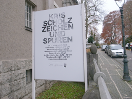
This Thursday, November 27th is the opening of the exhibition ‘Marks and Traces’ in which the artist Kris Scholz presents his latest work. We have designed the poster and flyer for the show at the Designhaus/Alfred-Messel-Haus on the Mathildenhöhe in Darmstadt. The show will be open until January 11th.
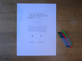
Next week, on November 19th, the latest German-Polish Award will be presented to two organizations in Berlin. We have redesigned the award certificate which will be given to the winners in the name of the German and Polish governments. The prize has, in previous years, been given to individuals and organisations who have done good for the relationship between the two countries. Amongst them Willy Brandt, Tadeusz Mazowiecki, Richard von Weizsäcker and Lech Walesa.
We are currently working on a website for fig-2 (site launch on 5 December 2014), a revival of the seminal exhibition cycle fig-1, developed by Mark Francis and Jay Joplin in 2000. fig-2 will be a year-long exhibition held at The Studio, ICA and will feature a total of 50 projects in 50 weeks, opening with a new show each Monday evening. The event is curated by independent curator and writer Fatoş Üstek.
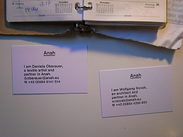
Slowly but steadily the visual identity we designed for Berlin and Salzburg based Anah architects is being implemented. After the website went online at the end of last year, the business cards have now been delivered to Berlin/Salzburg. More to come (sooner or later).
Books, books, books. 2014 has been a year of books. We are working on four new publications in total, but have a feeling they still have a way to go… updates to follow.
Great news from Germany, where our book, I used to be a design student – 50 graphic designers then + now was awarded a Bronze at the ADC (Art Directors Club) für Deutschland. Anish Kapoor – Symphony for a Beloved Sun was also nominated for a Yellow Pencil at this year’s D&AD Awards.
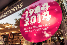
We recently designed several items for the 30th birthday of the Second Hand Records shop of our friends in Stuttgart. As well as flyers, stickers, buttons and vinyl lettering for the shop window we designed a ‘30 Year Record Poster’ featuring a favourite record for each of the last 30 years, as selected by the shop staff. Amongst them the fantastic ‘All shook down’ by ‘The Replacements’ as the best record of 1990, ‘Crooked Rain, Crooked Rain’ by ‘Pavement’ for 1994 and ‘Sometimes I wish we were an Eagle’ by ‘Bill Callahan’ for 2009.
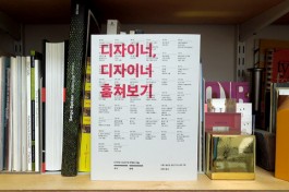
The Korean edition of our book, ‘I used to be a design student’ published by ag books has just arrived in the post — a lovely sight! Also, good to see that our cover design survived a marketing process on the other side of the world!
Last week we flew to Tokyo to pick up the Grand Prix at the Tokyo TDC Awards 2014, attended the exhibition opening of the winning entries at the Ginza Graphic Gallery (ggg), and gave a talk during TDC Day. Thank you to our hosts – we had a great time out there!
ADC New York 2014 (ADC93): the design of the book ‘Anish Kapoor: Stone’ published by Sakip Sabanci Museum in Istanbul has won us a Bronze Cube, and the design of the book ‘Symphony for a Beloved Sun’ (Anish Kapoor) published by Walther König and the Martin Gropius-Bau in Berlin, a Silver Cube at this year’s ADC awards.
If you are in Tokyo between April 4–28, you can see our ‘Grand Prix’ winning work exhibited in this year’s Tokyo TDC Exhibition at the Ginza Graphic Gallery (ggg), DNP Ginza Bldg., 7-7-2 Ginza, Chuo-ku, Tokyo. The show is open between 11:00–19:00 (until 18:00 on Saturdays) and closed on Sundays and national holidays (admission is free). Also, on Saturday, April 5, between 12:30–18:30 we will giving a talk at the Design Forum TDC DAY, which will also include lectures and discussions by other Tokyo TDC Award winners and guests. The venue is the Joshibi University of Art and Design, Suginami Campus. For more information please visit: http://tdctokyo.org or email: info@tdctokyo.org.
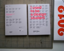
‘ I used to be a design student – 50 graphic designers then + now’, the book we wrote, edited and designed, which was launched in February 2013 by Laurence King, has just been awarded with a ‘Certificate of Typographic Excellence’ by the The Type Directors Club New York 2014 (TDC60). From 2,000 entries from 43 countries, 209 from 18 countries were selected.
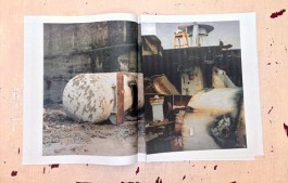
Our latest project, ‘A Fish Out of Water’, has just arrived back from the printers. The 24-page newspaper publication documents the mammoth task of the breaking of the RFA Grey Rover at Canada Docks, Liverpool during 2009 and 2011 through a sequence of jumbled-up images by photographer Tim Mitchell.
We are delighted to hear that our design of ‘Symphony for a Beloved Sun’ for Anish Kapoor’s major exhibition at the Martin-Gropius-Bau in Berlin has been awarded the Grand Prix at this year’s Tokyo TDC (Type Directors Club) Awards 2014 out of 2,958 entries. For more information visit the Walther König website .
The holding page we designed for Anah is now online. Anah is an architectural and landscaping practice based in Salzburg and soon in Berlin. It is also a magazine. For more answers about Anah, visit www.anah.eu.

Frank returned from a 10 day trip to China, were he gave talks and workshops at Chengdu Art College and at Xijing Art College in Xi’an. There were also a lot of calligraphy welcoming ceremonies and welcome dinners. I like Chinese!
We have just launched Eat the Soup, a website of photographs documenting Billy’s mental unravelling during the past six years. Visitors can follow his journeys chronologically by clicking on the dates, geographically by clicking on the locations, or thematically by clicking on the words silently spoken in his head. Thank you to Chris Brown for the programming.
There has been a lot of flying recently: Billy returned from Istanbul then flew to Parma to collect a Fedrigoni Top Award for our Zumtobel annual report 2011/12 at the wonderful Teatro Farnese. In the meantime, Frank is preparing for his first ever trip to China, where he will give talks and workshops at Chengdu Art College on October 28th and at Xijing Art College in Xi’an on November 1st.
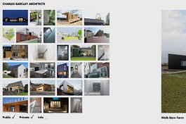
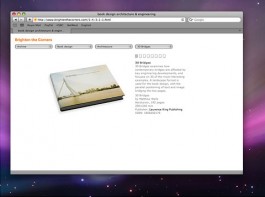
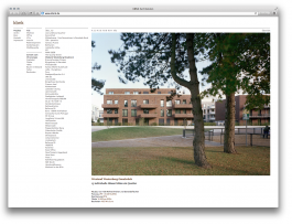
Our newly designed website for Brixton-based Charles Barclay Architects www.cbarchitects.co.uk has recently gone online, and is slowly growing with more and more projects added daily. Avoiding the often over-complicated categorising in architect’s websites we decided instead to simply separate case studies into ‘Public’ or ‘Private’ categories. Visitors can therefore choose between the two, or browse both without a structure being imposed on them. Images are given prominence throughout the website, while further information and PDF case studies are visible by clicking the ‘Info’ button. Thank you to Simon French for the programming.
For the past two months we have been working on the design of ‘Anish Kapoor: Stone’ the first ever comprehensive collection of the artist’s stone works dating from the 1980s to the present day. The publication will accompany the opening of Anish Kapoor’ exhibition this Monday, September 9th at the Sakıp Sabancı Museum, Istanbul for which we have also designed the small catalogue. In the meantime, the proof reader has been pretty busy correcting the final, final, final proof.
To add to our Gold Cube (Art Directors Club USA) and Golden Nail (Art Directors Club Germany), we now have our very own Yellow Pencil from this year’s D&AD Awards (Design & Art Directors Club UK)! For a full list of the winners visit the Creative Review Blog.
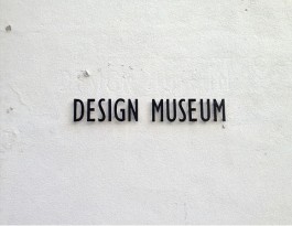
Today, May 21st, Billy is giving a PechaKucha as part of ‘PechaKucha X Design’ at the Design Museum in London along with nominators and nominees from this year’s Designs of the Year 2013 exhibition. Other speakers include Patrick Bergel, Christophe Egret, Duncan Fitzsimons, Adrian Hon, Frith Kerr, Oliver Knight and Rory McGrath, David Kohn, Diogo Seixas Lopes, James Shaw, Pete Thomas, Matt Webb and Hal Watts.
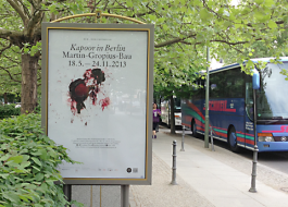
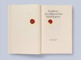
Today, May 17th, the exhibition by Anish Kapoor (“Kapoor in Berlin”) opens in the Martin-Gropius-Bau. We designed the poster, invitation and flyer) as well as the bi-lingual exhibition catalogue “Symphony for a Beloved Sun” which is published by Verlag der Buchhandlung Walther König.
After winning a Golden Cube at the Art Directors Club in the US this year we have now won a Golden Nail from the Art Directors Club in Germany. What’s next – a Golden Cage? For other awards we have won this season read here.
We recently designed ‘Up and Down the Pyranees’, a 28-page booklet of images taken at various heights of the Pyranees mountain range by photographer Tim Mitchell. Images include a sign post, snow, a dead cow, and at the highest peak, some graffiti. The book will go on sale at the Westminster Reference Library, on Saturday 11 May 2013, 7.30–10.30pm, 35 St Martin’s Street, London WC2H 7HP, and at Tim’ website thereafter. More about the event here.
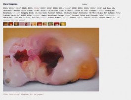
We are very happy to see our website for painter Clare Chapman, www.clarechapman.com, in the pipeline for quite some time now, finally up and running in all its glory! The design breaks down the painting caption into its component parts (title, year, size, materials) to use as the website navigation. Thank you to Chris Brown for the development.
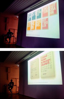
We recently presented our new book, I used to be a design student , along with thoughts about our student and professional work at the University of Darmstadt in Germany where Frank is also professor of Graphic Design. Many thanks to the guest speakers and contributors to the book, Holger Jacobs from Mind Design, Liza Enebeis from Studio Dumbar and Matthias Görlich from Studio Matthias Goörlich who shared their work and insights into the happy and not-so-happy realities of being a designer.
It’s awards season (again)! Our design for the Zumtobel Annual Report has been awarded a Golden Cube at the 92nd Annual ADC Awards (Art Directors Club) in the US. For a full list of winners click here or for information on the selection process view the video below. Our report was also nominated as prize nominee work at the TDC Tokyo Awards (Type Directors Club), where our posters for the lecture series ‘A Bird Never Flew On One Wing’ was also selected as excellent work. The same posters also won at the TDC Awards New York (Type Directors Club). That’s all for now.
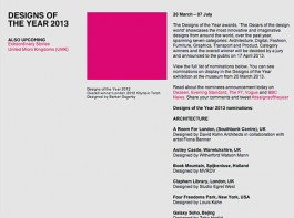
It’s been great to see our first ever book to hang on a wall at the Design Museum today, selected for the Design Museum Designs of the Year 2013 Awards. It was also good seeing plenty of copies of our new book ‘I used to be a design student’ at the Design Museum Shop. Whoever buys a copy gets a Zumtobel Annual thrown in for free. More information on the exhibition here.
Following the launch and presentation of our new book, ‘I used to be a design student’ at the Camberwell College of Arts we were invited to do a two-day workshop with the BA Graphic Design students there. Lots of great responses by the students, it was fun being back.
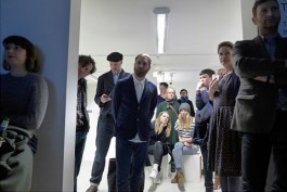
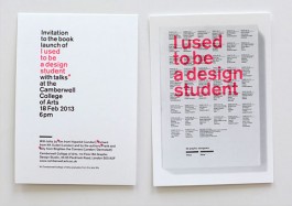
Lots of old friends and familiar faces at Monday’s launch of our new book ‘I used to be a design student’ at the Camberwell College of Arts. Thanks to everyone for coming, Richard Walker and Tim Balaam for talking, and a special thanks to Tracey Waller, Course Director for BA Graphic Design for her support and for helping organise the whole evening!
The time has come! On Monday, 18 February 2013, at 6pm we are returning to Camberwell College of Arts after 16 years for the launch of our book ‘I used to be a design student’ published by Laurence King. So please come along if you are free! From 6.30pm onwards we will talk about the concept behind the book and the 5 years it took us from first conceiving it to finally getting it in our hands. Richard Walker from KK Outlet and Tim Balaam from Hyperkit will then give us an insight into their student years (also at Camberwell) and what has happened in their professional lives since. This should all last approximately an hour; then there will be drinks. You will find more information on the book here and here. And here are ways of buying the book online. The full address for the launch is: Camberwell College of Arts, 1st floor, BA Graphic Design Studio, 45-65 Peckham Road, London SW5 8UF.
Happy New Year! Our annual report designed with Anish Kapoor for lighting company Zumtobel Group has been nominated for the Design Museum Designs of the Year 2013. You can read more about the shortlist at the Creative Review Blog. More information about the Designs of the Year exhibition to follow.
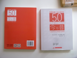
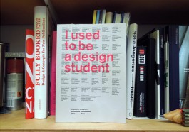
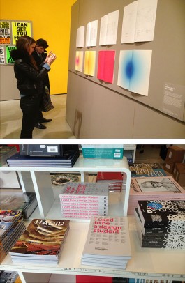
Last week we received an advance copy of ‘I used to be a design student’, the book we have been working on as authors, editors and designers for the past 2 years. Published by Laurence King and officially launching on February 18th 2013, it features the student and professional work (as well as past and current influences) of 50 graphic designers. Amongst them are Andrew Stevens (GTF), Daniel Eatock, Fons Hickmann, Holger Jacobs (Mind Design), James Goggin, Ken Garland, Kirsty Carter (APFEL), Liza Enebeis (Studio Dumbar), Maki Suzuki (Åbäke), Margaret Calvert, Paul Barnes, Prem Krishnamurthy (Projects Projects), Sascha Lobe (L2M3), Stefan Sagmeister, Urs Lehni. The book offers a rare chance to find out how graphic designers feel about their education and profession and gives the low-down about their student days and their professional lives. A piece of their college work is shown alongside an example of their current work. Each designer also offers a key piece of advice and a warning. The book looks at the process a designer goes through in finding their ‘voice’. Topics addressed include how ideas are researched and developed; design and other cultural influences, then and now; positive and negative aspects of working as a designer; motivations for becoming a designer; and whether it’s really possible to teach design. There will be an official book launch on February 18th 2013 at 6pm at Camberwell College of Arts in London, 1st floor, BA Graphic Design Studio, 45–65 Peckham Rd, London SE5 8UF. The German book launch will be on the 24th and 25th of April, 7pm at the faculty of design, Hochschule Darmstadt, Olbrichweg 10, 64287 Darmstadt, www.fbg.h-da.de. To buy the book online go to amazon.com, amazon.co.uk or amazon.de. More news to follow in February 2013.

Our latest catalogue for Anish Kapoor has just arrived from the printers. Printed on 60gsm paper, and bound as an asian fold, 448-page publication, ‘Anish Kapoor/Objects’ was published on the occasion of the artist’s second major solo exhibition in Asia at the Leeum, Samsung Museum of Art in Seoul, Korea. The design of the catalogue groups his artworks, models and sketches into distinct ‘object’ chapters: objects full of darkness, monochrome, non-objects, proto, internal, and auto-generated objects. Essays are by Tae Hyunsun, Lee Ufan, Joan Kee and Homi K. Bhabha.
We recently designed the publication to accompany Anish Kapoor’s exhibition of new works at Lisson Gallery in London. Entitled ‘In the Shadow of the Tree and the Knot of the Earth’ we designed the volume as a 320-page, black and white publication of the artist’s drawings with variously-sized, full-colour images of the new works inserted within.
The German half of Brighten the Corners has moved into the woods. Our new studio is in the Odenwald region near Darmstadt and Frankfurt. Click here for map and contact details.
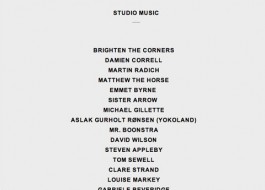
It’s great to be the latest addition to the ever growing list of studio playlists at Studio Music (funny how you can find time to do certain things even when you are too busy…)

Since March, we have been working with Anish Kapoor on the 2012 Annual Report of lighting company Zumtobel, and the results have recently arrived from the printers. Taking his 1998 video work ‘Wounds and Absent Objects’ as a starting point, we separated the report into two separate volumes: a black & white, text-only volume containing all the facts and figures for the financial year, and a silent, colour-only publication, a graphic reinterpretation of the original video projection into print. To see the entire colour report click here or to order a copy click here and tick ‘Annual Report 2011/12 (available from July 27, 2012)’.
We have worked with artist Anish Kapoor on the design of a special 3D cover inspired by the Orbit for L’Équipe magazine. The issue, focussing on the London Olympics, is out on July 28, 2012.
It’s been a pleasure watching our most colourful job to date going to press last week. A total of 10 (standard and bespoke) neon colours blending, overprinting and bleeding. The finished item is due in July…
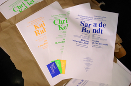
Frank is currently curating ‘Halbfünf’, a series of talks at the Faculty of Design at the Hochschule Darmstadt were he also teaches. The topic of this series, ‘A bird never flew on one wing’, presents designers who do other things as well. The speakers and dates are: Christoph Keller (Editor, Book Designer, Curator and Choice Fruit Distiller), 22. May 2012. Kai von Rabenau (Photographer, Graphic Designer and Publisher, Editor, Label-Owner), 5. June 2012. Sara de Bondt (Graphic Designer and Publisher, Editor) 20. November 2012. Click here to find further information.
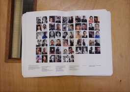

In 2011 Frank took a 6-month sabbatical away from his responsibilities at Hochschule Darmstadt to research a topic he has always been interested in: design and attitude. During this time, he interviewed over 100 designers from all over the world, asking them professional and personal questions in equal measure and collecting examples of their student and professional work. We are delighted that the resulting book, is in the pipeline as a Laurence King publication to be released on 18th April 2013. More information to come…
We are currently working on the design for the annual report of international lighting solutions company Zumtobel. The report will be released this summer. More information to come soon.
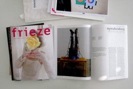
The fourth issue of frieze d/e magazine (and the final to be art directed and designed by us) has been sent into the world, during a freezing week in Berlin…
We are winners in the Type Directors Club New York Competition 2012 (TDC58) in the category TDC Communication Design for the book and jacket ‘I have nothing to say’ – Interviews with Anish Kapoor. The winners will be featured in the book Typography 32 and in an exhibition in New York mid-year.
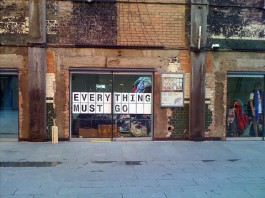
We have just finished working on the communication design for Everything Must Go, a three-day exhibition following the journeys of worn clothing as they are sold for reuse and recycling across the world. The show brings invisible global waste economies into public view, explores the people involved and the impact these businesses have upon their lives, and questions our ability to control, contain and curtail waste. It will be up for three days (20, 21, 22 January) a from 11am to 6pm at the Bargehouse at Oxo Tower Wharf in London, SE1 9PH.
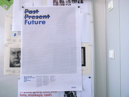
The Tokyo Type Directors Club (TDC) has awarded us with an In-Book Award 2012 for a poster called Past Present Future for the DAAD in London.
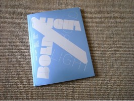
Some of our (old) work has been featured in the new issue No. 16 of »Slanted – Bold Light«.
We recently returned from Berlin, where we completed the design for issue #3 of frieze d/e magazine. Billy wasn’t sure how smoothly it all went, but Frank was delighted! The moment was captured by Kai von Rabenau.
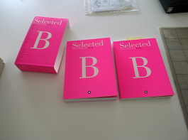
Two of our projects (Chez Vous Identity and DAAD Competition Posters 2010) are featured in Selected B, a publication series by Barcelona based publisher Index.
New studio, new year (almost), and a new visual identity. Our fluorescent stationery just arrived from the printers in Germany.
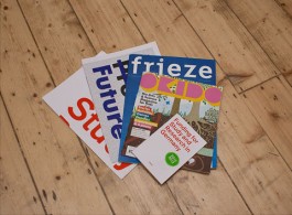
Quite a few projects have recently arrived from the printers: the newly designed DAAD Funding poster and booklet with study and research opportunities for 2012–2013, issue #2 of the new, bilingual frieze d/e magazine, as well as the latest Okido ‘Dirt’ issue. A microsite for the DAAD Competition ‘Past Present Future’ is also online.
We have just finished working on ‘Dirty Corner’ a publication of sketchbook drawings, paintings, architectural models, and sculptures by Anish Kapoor, dating from 1974 to the present and focusing on the consistent concern in the artist’s work with the void. We opted for a loose and simple approach to the layout, occasionally contrasting the dark and bloody subject matter with interruptions of light (Pantone yellow neon). ‘Dirty Corner’ will be published by Skira on the occasion of Kapoor’s exhibitions in Milan this year. (Distributed in the US, Canada, Central & South America by Rizzoli, and in the rest of the world, by Thames & Hudson).
After one year in the making we are really happy to announce the launch of the new website for Anish Kapoor with us having developed the concept, design and programming. It is a very simple, 2-level website, but with lots and lots of content. Simple but dense. Hope you enjoy it. We are very happy to see this site come to life!
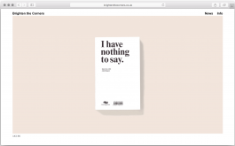
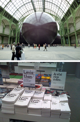
We just came back from the opening of Leviathan, the latest enormous sculpture by Anish Kapoor in the Grand Palais during MONUMENTA in Paris. We have designed two books for this occasion: “I have nothing to say”, a 328 page pocket size bilingual (French/English) book with various interviews plus the 240 page exhibition catalogue “Leviathan”, showing mainly preparatory sketches, models and writing.
The latest poster for the yearly DAAD (German Academic Exchange Service) competition with this years title “Germany 2051 – What will it be like?” has just come back from the printers. We have been designing the competition material for the London office of the DAAD since 2008 now. In the background of the poster one can read the entire German history according to Wikipedia and set in 6pt Times. A microsite for the competition will go online in two weeks time.
Bye-Bye! We have just designed the last ever printed issue – No 18 – of the DAAD (German Academic Exchange Service) Newsletter. After having worked on this for the past 10 years (almost the entire life span of Brighten the Corners) it is time to say good bye. The next issue will be in an electronic format and so far we haven’t been asked to do this. So this is a double good bye…
We have just been designing the latest identity and call for entries for the Allianz Business to Art Awards 2011. This is the fourth year since it all came to life and it’s yet another play on the logo which we designed five years ago.
We have just returned from Berlin, where we finished the design for the first ever issue of frieze d/e (see also our News from November and March). The magazine is currently being printed, and launches on April 28th. (Photograph by Magdalena Magiera, frieze d/e, Berlin)
During this “awards season” we have had a few appreciations of our work, both for the studio and for the teaching we do. We have received the following awards: 100 Best Posters Award, Art Directors Club New York (Bronze in the category “Book Design/University Press Book”), Output 14 and ΕΒΓΕ 2011 (Greek Graphic Design & Illustration Awards – Visual Identity Commendation).
Conversations about Culture, a book containing the conversations about culture and the arts by people all over Ireland, has been published by Business to Arts, Dublin. Boz gathered all the material over a one-week period and we have designed the resulting book in collaboration with Ben Branagan. Photographs by Matthew Thompson.
We have been asked by Barcelona based design publisher Index Book to select work for a publication featuring interesting design projects completed during the past year. The name of the publication is Selected B. On top of that we gave a workshop with the title “Single Sentence Manifesto” during the Selected B Conference which took place from on the 25 & 25th of March in the Torre Agbar in Barcelona.
We have been working (see also our News from November) on the design for the launch of frieze d/e, a new quarterly art magazine hitting the newsstands in Germany, Austria and Switzerland this May. Some information from the official press release: ‘Frieze Publishing, the publishers of frieze the international contemporary art and culture magazine, is launching a new publication, frieze d/e, in Spring 2011. frieze d/e – a fully bilingual German/English quarterly – is a separate publication with its own editorial team and independent content. ‘d/e’ stands for ‘Deutsch’ and ‘English’. With editing and production based in Berlin, the new magazine will offer in-depth coverage of contemporary art and culture throughout Germany, Austria and Switzerland while closely following the international artist communities in this region.’ Full press release.
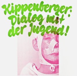
The Tokyo Type Directors Club (TDC) has awarded us with two In-Book Awards 2011. One in the category Mark & Logo/Corporate stationery for the work we have done for Athens based company Chez Vous. And another one in the category Poster for the work we have done for a screening of the film Kippenberger at Darmstadt University of Applied Sciences, Faculty of Design.
We designed the directional billboard ads in Stuttgart city centre and all graphics (vinyl signage, bags, posters and postcards) for the new store of Second Hand Records in Stuttgart. For more information on Second Hand Records click here.
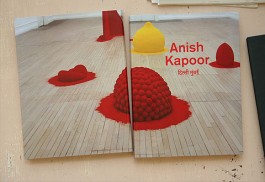
The catalogue we designed for the Anish Kapoor India exhibitions in New Delhi and Mumbai has arrived from the printers. Published by the British Council and Lisson Gallery, the 220-page catalogue features a retrospective of Anish Kapoor’s work, and a gallery of his architectural models. It also includes a conversation with the exhibition curators, Andrea Rose and Greg Hilty, essays by Homi Bhabha and Nancy Adajania, and an extensive, illustrated chronology. We printed text pages on a tinted, uncoated stock, works on a coated, white stock and bound the catalogue with red thread and head/tail ends. All text was printed in red.
Opening night of the Anish Kapoor show at the Mehboob Film Studios in Mumbai. We designed a 38×18 metre banner of red wax from Shooting Into the Corner to cover the entire facade of the building. For more information about the exhibitions in Delhi and Mumbai and an interview with Anish Kapoor click one of these links.
We have been working on the design of a new bilingual (German/English) art magazine. A dummy has been designed and the publisher is presently exploring the market potential for such a release. Everything is confidential at the moment, more information to follow if everything goes ahead…
The bus shelter ads, billboards and posters we designed for the Anish Kapoor exhibition in India are going up in the streets of New Delhi and Mumbai. For press about the exhibitions click on these links.
This Friday and Saturday, 12th – 13th November, we are opening our drawers once again to sell our products at the Small Publishers Fair. We have a little stall together with Tom Gauld (see news below). The fair is open from 11am to 7pm each day and admission is free. The address is Conway Hall, Red Lion Square, London WC1.
We have just designed and produced the latest project — 12 Postcards – by Tom Gauld. More about Tom’s work.
We’ve been commissioned to develop the exhibition identity, marketing material, catalogue design and merchandise for Anish Kapoor’s first ever exhibition in India. Organised by the Ministry of Culture, Government of India, NGMA, British Council and Lisson Gallery , the exhibition will take place in two venues, the National Gallery of Modern Art in New Delhi (30.11.2010–16.01.2011), and the Mehboob Film Studios in Mumbai (28.11.2010–27.02.2011). More information to come soon.
It’s great to see our work featured in Selected A — Graphic Design from Across Europe, a selection of work produced by European creative studios during last year. Click here for more information about this publication.
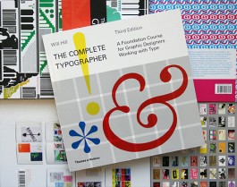
The Complete Typographer — A Foundation Course for Graphic Designers Working with Type, written by Will Hill and featuring our work has just been published by Thames & Hudson. Click here for more information on this book.
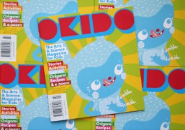
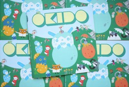
We’re happy to see the latest ‘Body Noises’ issue of Okido back from the printers and in bookshops all over London (including its first appearance at WHSmith’s). We worked with Okido editor Sophie Dauvois in developing a redesign that communicates what this kids’ Arts & Science magazine is all about to a wider audience. Click here to buy this issue on the Okido website.
The ‘find Funding’ booklets and posters which we have been designing for the DAAD London (German Academic Exchange Service) for the last 4 years just came back from the printers.
We received this email today from Australia, we’re glad to see our posters traveling the globe! Hi Brighten the Corners, My friend bought me the Inbox prints for my birthday and got them shipped to Australia. I got them framed this week and I just wanted to pass on this photo to show you how rad they look. I just love them. Thank-you! Kind Regards, Tara.
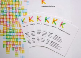
We designed the logo and visual identity for KASAPI Hellas, an organisation based in Athens, dedicated to improving the lives of Philippine migrant workers in Greece. Drawing on the rich cultural heritage of the Philippines and the participatory nature of the organisation, we used a system of overlapping colours to develop illustrations and a set of different logos.
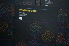
We recently designed the poster, invitation, programme, and winners’ brochure for the 2010 Allianz Business to Arts Awards, an annual event recognising collaboration and creativity in business and arts partnerships in Ireland. Click here to visit the Business to Arts website.
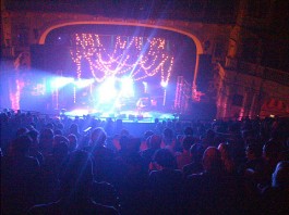
Pavement (the band) played Brixton Academy on May 13th, a few metres down the road from our studio.
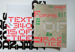
We’ve contributed work and bold predictions about the future of Graphic Design to the latest issue of Idea magazine: Idea No. 340: Forms of Practice. Other contributors include APFEL, A2/SW/HK, Sara De Bondt studio, Anthony Burrill, Hyperkit, Mind Design, Music, James Goggin and others.
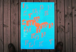
Show Down, 12 hours of conflict, is an exhibition with projections, sound, films and performances designed and organised by 22 students of the Faculty of Design, University of Applied Sciences Darmstadt (Germany). The exhibition was developed in a workshop Frank did with his students and in collaboration with Matthias Görlich and Jörg Stürzebecher.
“THANK YOU — YOU’VE MADE MY DAY! I don’t care anymore that I am not going on holiday! Many kisses.” Inbox, our anniversary poster set with incoming emails from the last ten years of our practise, was selected for The Creative Review Annual 2010.
D&AD Award 2010 (In-Book) in the category Book Design Typography for ‘3 Minutes’, a collection of ten diverse and extremely powerful 3-minute interviews about the effect of the Tibetan conflict. Our contribution to the collection was a typographical interpretation of a 3-minute interview with Tenzin Lose into a 16-page booklet. Other contributors to the project included Bibliotheque, Stefan Gandl (NeubauBerlin), Nick Hard (Research Studios), Jeff Knowles (Research Studios), Abbott Miller (Pentagram), and Un.titled. For more information about DAHRA (Designers Against Human Rights Abuse) or to buy the book click here. All proceeds go to the Tibet Relief Fund.
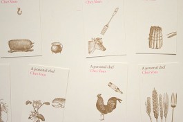
Eat the cow! Sauté the onion! We developed the logo, stationery, promotional literature and website for Chez Vous, a complete home dining experience in Athens created by French chef Tony Mordelet and hospitality professional Eirene Kollintza. Our design plays with the idea of cooking as an art that brings different elements together. For more information email info@chezvous.gr.
Bitte laßt die Blumen leben! (Please let the flowers live!) is a publication Frank and Matthias Görlich developed with students during a workshop at the Faculty of Design, University of Applied Sciences Darmstadt (Germany). The publication deals with the question of what is good, bad and ugly design and whether one can give answers of that kind.
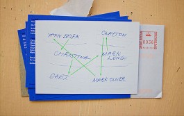
We designed the invitation for ‘Version’ an exhibition featuring work of: Christina Christoforou by Yann Brien, Mark Oliver by Clayton Junior, Yann Brien by Mark Oliver, Clayton Junior by Mark Long, Gabriele Herzog by Christina Christoforou, and Mark Long by Gabriele Herzog. The private view is on Tuesday 9 March, 6pm, at Medcalf, 40 Exmouth Market, London Ec1R 4QE. The show ends on 30 April 2010.
The ‘Learn German’ concertina we designed for the Goethe-Institut London is going out to UK schools this month. Developed with parents and carers in mind, it outlines the commercial, professional and cultural benefits of learning German.
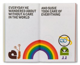
Our 3 books (“Victor & Susie”, “Stanley & Marvin”, “Susie & Edward”) which we wrote, illustrated, designed and produced have won a TDC Tokyo Type Directors Club In-Book Award 2010 in the category Experimental Work.
The posters and postcards we designed for the DAAD’s 2010 Loanword Competition just came back from the printers. The concept was based around the saying “Don’t give me that spiel”. Visually the posters and postcards refer to old bill posters.
Our compliment slip “edited” by 5 year old Gabriel – lovely. A happy new year to everyone!
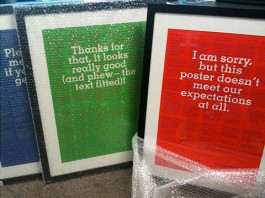
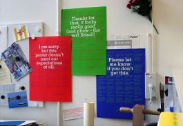
In December we printed INBOX, three posters with a selection of our incoming emails from the past 10 years. Here are some of the email responses we received: Yay! Congratulations. 10 years! And your work still looks great! @ Absolutely love our post this morning… Fantastic! I think I recognise an email or two in there though… @ Die Geburtstagsposter sind gestern bei uns angekommen und haben heute morgen beim Frühstück für etliche Lacher gesorgt. Wir sind ein wenig neidisch, dass ihr es in 10 Jahren geschafft habt auch ein Poster mit Lob zu füllen. Respekt! @ Thank you for your posters! They are very nice. @ Thank you very much for your mail — I like the idea of an email-history over ten years, brilliant! Especially the slightly aggravated stuff is intriguing 😉 All the best to Brighten the Corners for the next ten years! @ Got the posters, they cheered our living room, thanks a lot! @ Vielelicht magst du uns ja auch bei den Reviews verlinken. Wenn du irgendetwas geändert haben möchtest, gib mir Bescheid. Ich finde die Idee echt klasse… ich finde, das ist ne sehr typische Arbeit von dir 🙂 @ Μόλις έλαβα τα ποστεράκια σας και η μέρα μου ξεκινάει με πολύ χαρά. @ Thanks for the posters — I love these, brilliant idea — in particular the red one ‘I am sorry but this poster…’ has a particular resonance for me. It’s going to take pride of place in my studio. @ I loved the celebratory posters. Good luck with the next ten years. @ Got the lovely posters at the RCA — thank you @ Billara! Just got your inbox posters. Thanks for sending. Excellent! Read some of them to my sister (she of the broadcast design company) and she was weeping and crying all at the same time. Very emotional. @ I received the posters on the last day I was in London actually. It’s a really nice idea, thank you for sending them over! Some of them are so absurd I was laughing all the time. @ Thanks for the lovely prints – they caused familiar sighs and chuckles all over the studio. @ Well you certainly gave us a good laugh. It is a shame if you have grown up, children usually behave better than adults… Glad to see we are not the only fussy ones. I can just imagine you saving these emails over the years. Congratulations on 10 years and all the very best for the future. @ Thanks, the posters are great! Nice to brighten up the corners of my office. @ Έφτασε ένα ωραίο πακετάκι με δύο μικρές φωτογραφίες της queen. Πόσο νέα δείχνει! My compliments. Έκανες ωραία δουλειά μεγάλε. Θα στολίσω το δωμάτιο του μπαμπά. @ Just got my set of posters — and am sitting at my desk laughing to the point of tears. Everyone in the office is looking a little concerned on my behalf. @ Just received my copy from the german partner. Spent half an hour reading and enjoying every one of the messages! Great stuff. @ Thanks so much for the set of posters that arrived today. Very nice surprise. A brilliant project — like it a lot. Saw them online on your new (and also nice) website and CR. Congrats all around! 8)
Brighten the Corners is ten years old. We’ve worked on a lot of projects during this time. And received many many emails, all of which played a part in how the projects turned out. So, to celebrate our tenth anniversary we’ve decided to give these daily exchanges a long overdue public platform. This is a representative selection, not just the positive or amusing ones, but also the bad, the confused, the dull and the ridiculous, each one an inseparable part of the design process.
Our new website is online since December 1st, just in time for our 10th anniversary. Our old website has served as well for 5 years. And although we were quite fond of it, we also needed change. Hip Hip Hurrah! Thanks to Stephan Barbe who programmed it.
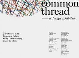
Frank was invited to create a poster on the subject of “Common Threads”. The exhibition with the same title took place at the Emily Carr University in Vancouver and presented also posters amongst others by Albert Folch, Henrik Kubel, Hyperkit, Silke Klinnert, Simon Svärd.
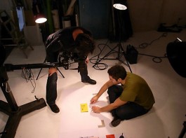
In October we had a photo-shoot for all the pictures (250!) for our new website in a studio in Stuttgart. Photographer: Thomas Herrmann. Thanks to him and Kristin Schoch who helped doing the cut outs and retouching.
Close Up – 10 Years of European Design Projects by the Helen Hamlyn Research Associates at the Royal College of Art 1999–2009. 25 September – 6 October 2009 included work we have done for the Italian Cultural Institute in London.
We were invited to produce a 16 page booklet for “3 Minutes”. The premise of the book is to show the full extent of the Tibetan conflict through 10 diverse and extremely powerful 3-minute interviews, each describing the 3 minutes that changed their lives. All contributors were asked to translate these minute interviews into 16 printed page booklets using primarily typography. The result is a book made up of 10 booklets. The book is available for £10 with all proceeds going to Tibet Relief Fund and being distributed by Subism. Other contributors to this project are Bibliotheque, Stefan Gandl (NeubauBerlin), Nick Hard (Research Studios), Jeff Knowles (Research Studios), Abbott Miller (Pentagram), Un.titled.
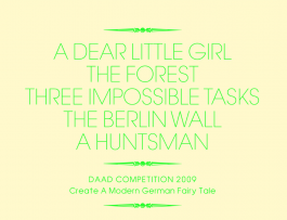
DAAD UK Student Competition: we have designed the competition material for the DAAD’s ‘Create A Modern German Fairytale’ competition. Entrants can respond by any medium they choose. Click here to visit the site and for information on how to enter.
The website we designed for Stuttgart-based photographer Thomas Herrmann is now online.

For a letterpress poster we have designed to promote the screening of the film “Helvetica” at the Faculty of Design in Darmstadt we have been awarded with an Art Directors Club Germany Award in the category Typography.
A publication (“Farben on Demand”) which Frank and his students at the Faculty of Design in Darmstadt have done together with James Goggin from Practise has been awarded with an Art Directors Club New York (ADC) Cube Award 2009 in the category Book Design (Public Service/Non-Profit Book). The award was presented in New York and handed over to two of the participating students.
The Tokyo Type Directors Club (TDC) has selected the logo-work we have done for “Business to Arts”, an organisation based in Dublin, Ireland, for their Annual Awards 2009.
The website we designed for Hamburg-based kbnk Architects is now online.
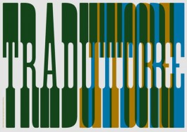
We designed Traduttore, Traditore (Translator, Traitor) an A3 print for Issue 1 of Making Do magazine. The issue explores translation through various mediums and includes work by Christina Christoforou, Sonja Lau, Andreas Pisac, and Mary Ikoniadou among others. Click here for more information on the Translation Issue or here to visit the shop.
October 2008
We wrote, illustrated, designed and published a children’s book for adults – Victor & Susie. It will be in selcted shops from November 1st. The book can also be purchased directly through this website for £5/€7.
September 2008
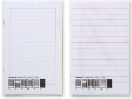
We designed and produced 6 different notebooks with 6 different lined patterns and colours. Gold cut on the long right edge of each notebook and golden staples. Comes in a see-through bag. One notebook can be purchased for £3/€4. All six for £15/€20.
May 2008
We received two ADC Awards 2008 (Art Directors Club New York). One for the design of the programme for the Italian Cultural Institute in London and another one for the newsmagazine Accenture Ireland CCD 07.
March 2008
We recently designed the material (A1 poster and postcard concertina) for the DAAD (German Academic Exchange Service) competition. Deadline for entries is in November 2008.
May 2008
On the 14/5/08 we will give a talk to the 3rd year Graphic Design students at Camberwell College of Arts London. Camberwell college is where both of us, Billy and Frank, met and studied. We graduated there in 1997. It will be good and strange to be back. We are looking forward to it!
April 2008
On the 10/4/08 we will give a talk to the students at the Communication, Art and Design department at the Royal College of Art London.
January 2008
Design of a new programme of events for the Italian Cultural Institute in London. We asked the staff of the institute to collect their favourite Italian sayings, and used the cover of each issue as a fold-out poster to display them. Poster designed with Ian Gabb.
All the text on our website in the hope we get a higher ranking on Google etc.
Brighten the Corners is a design studio in London and Aschaffenburg (close to Frankfurt/Main). We, Frank Philippin and Billy Kiosoglou, established the studio in 1999 after graduating with an MA in Graphic Design from the Royal College of Art and run it to this day. We cover all areas of Graphic Design, including book/editorial, logos, visual identities, posters, websites, stamps and (exhibition) signage.
Contact United Kingdom Brighten the Corners (UK) / c/o Billy Kiosoglou / Studio AR03 Arbor House / Moulding Lane / London SE14 6BS / london(at)brightenthecorners(dot)com / T +44 (0)79 7997 0834 Map Contact Germany Brighten the Corners (D) / c/o Frank Philippin / Schloßgasse 1+3 / D-63739 Aschaffenburg / aschaffenburg(at)brightenthecorners(dot)com / T +49 (0)160 5536 117 Map
Awards
We’ve won quite a few awards–the most prestigious being the Grand Prix at the TDC Tokyo Type Directors Club, the Design Museum London Designs of the Year Award, a Yellow Pencil at the D&AD Awards, a Gold Cube at the ADC Art Directors Club New York, a Gold Nail at the ADC Art Directors Club Germany and Certificates of Typographic Excellence at the TDC New York Type Directors Club. Here the full list: Design Museum London Designs of the Year Awards 2013, nominated in the category Graphic Design • D&AD Design & Art Directors Club UK Yellow Pencil 2013, Yellow Pencil Nomination 2014 and Wood Pencil 2016, 2013, 2010, 2007 and 2005 • Tokyo TDC Type Directors Club Grand Prix in 2014, Grand Prix Nomination in 2013, Excellent Work/In-book Award in 2017, 2016, 2✕2014, 2013, 2012, 2011, 2010 and 2009 • TDC New York Type Directors Club Certificate of Typographic Excellence in 2014, 2013 and 2012 • ADC Art Directors Club New York Global Awards Gold Cube in 2013 and 2009, Global Awards Silver Cube in 2014 and Global Awards Bronze Cube in 2014 and 2011 • ADC Art Directors Club Germany Golden Nail in 2013, Bronze Nail in 2014 and In-Book Award in 2009 • iF Communication Design Award in 2014 • Fedrigoni Top Award Silver in 2015 and in 2013 • Stiftung Buchkunst Most Beautiful German Book Award shortlist in 2016, 2014 and 2005 • 100 Beste Plakate in 2002 and 2001 • Best of Corporate Publishing (BCP) Shortlist (Top 7) in 2013 • German Photo Book Award Shortlist in 2019
Clients
Over the years, we’ve worked with many clients including Anish Kapoor (UK), Aram Store (UK), Bolles+Wilson Architects (D), British Council (UK), Bundesfinanzministerium (D), DAAD (UK/D), Disney (UK/US), Fraunhofer-Institut (D), Frieze (UK/D), Goethe-Institut (UK/D), ICA (UK), Italian Cultural Institute (UK), Laurence King Publishing (UK), Martin-Gropius-Bau (D), RIBA (UK), Skira Editore (IT), Steidl Publishing (D), Second Hand Records Stuttgart (D), Walther Koenig Publishing (D) and the Vitra Design Museum (D).
Teaching
We’ve also been teaching Graphic Design since 1998. Frank has been a professor of Communication Design at the Faculty of Design, Darmstadt University (D) since 2007, and Billy is an associate lecturer at UAL Camberwell College of Arts (UK) since 2014, and currently a visiting practitioner at Brunel University London.
How we do things
• On good design • Having studied in an environment that valued originality and lateral thinking over style has informed our practise to this day and has greatly influenced the way we approach each design project. We still believe that concept-driven design leads to new ways of seeing and new ways of doing things. And therefore better design • On our approach • When we start work on a project, we try to get right to the heart of it and enjoy editing out all the unnecessary bits. Then we try to make work that is original, memorable, and direct • On beauty • It inevitably comes into what we do, but it’s not an objective in itself. We prefer to focus on the formation of a strong idea and how it translates into appropriate design (that’s the beautiful bit). Because looking for beauty doesn’t necessarily lead to beauty. Most of the times it leads to a momentarily stylish result that will age fast and ungracefully. Style is, by its nature, ephemeral. If, on the contrary, you put your faith in the idea and trust the design process, the outcome will have integrity, originality and longevity. We’re happy to look back at our portfolio from the past 18 years and see that most works stand the test of time • On doing it right • The deeper we’re involved in a project, the more you get out of us. We depend on respectful collaboration, not least because it will lead to work that surpasses expectations • On growing • We’ve kept our studio small, as we enjoy working on all stages of the process (including initial meetings, design presentations, design/layout, final artwork, and handling production). This means we personally handle a project from concept through to production, ensuring things don’t get lost in translation. When projects require more, we also have a reliable pool of writers, editors, architects, programmers, and artworkers, with whom we work to get the job done. With our experience and skills, you’ll get more than you pay for • On fees and free pitches • We’re not the cheapest designers – a bespoke approach and attention to detail never is – but you’re not paying for overheads. We don’t do free pitches. A commission is based on trust, a free pitch on lack of trust. Plus, they don’t work for anyone. When designers focus on securing a job, they aren’t exploring the countless possibilities of what that job could be • On specialising • We have always resisted it! We’re happy working with artists and corporates alike, with start-ups, organisations, architects and institutes. We also publish our own projects and teach Graphic Design.
Our Name
Before there was Brighten the Corners studio for design, there was Brighten the Corners, the album by Pavement. Although tracing the connection may seem difficult, the more persistent listener will find that repeated sessions of Type Slowly, Date w/ IKEA or Old to Begin will offer invaluable insights.
Jobs & Freelance
We don’t have any openings and we are not working with any freelancers at the moment. However, you can send us your portfolio and we will let you know if an opportunity to collaborate arises in the future: jobs(at)brightenthecorners(dot)com
Internships
Please email internships(at)brightenthecorners(dot)com
with your details and web links. We don’t take on interns on a regular basis–so don’t get your hopes up too high that we will offer you a placement. Students who have done an internship with us so far (in order of ‘appearance’): Julian von Klier, Stefania Tomasello, Kristin Schoch, Laura Heeks, Haruka Yamada, Tom Richter
Imprint & Copyright Notice (UK)
Billy Kiosoglou trades under the name of Brighten the Corners (UK). The website address is: https://brightenthecorners.com © 2019 Brighten the Corners. All rights reserved unless otherwise indicated, all materials on these pages are copyrighted. No part of these pages, either text or images may be used for any purpose other than personal use, unless explicit authorisation is given by Brighten the Corners. Therefore reproduction, modification, storage in a retrieval system or retransmission, in any form or by any means–electronic, mechanical or otherwise–for reasons other than personal use, is strictly prohibited without prior written permission.
Impressum & Copyright Hinweis (D)
Frank Philippin firmiert als Freiberufler unter dem Namen Brighten the Corners (D), Ust-IdNr. DE225564139. Die Webseitenadresse ist: https://brightenthecorners.com. © 2019 Brighten the Corners. Inhaltlich verantwortlich gemäss § 55 abs. 2 Rstv: Billy Kiosoglou und Frank Philippin. Haftungshinweis: trotz sorgfältiger inhaltlicher Kontrolle übernehmen wir keine Haftung für die Inhalte externer Links. Für den Inhalt der verlinkten Seiten sind ausschliesslich deren Betreiber verantwortlich. © 2018 Brighten the Corners (D). Die auf dieser Webseite wiedergegebenen Texte, Bilder und audiovisuellen Inhalte sowie das Layout und Design der Webseite sind urheberrechtlich geschützt und dürfen ohne vorherige Zustimmung des Rechteinhabers nicht zu anderen als rein privaten Zwecken verwendet werden. Insbesondere ist eine öffentliche Wiedergabe oder Veränderung der Inhalte unzulässig.
Website designed by Brighten the Corners, running on WordPress with Lay Theme.
Bibliography
Alexander Girard – A designer’s Universe, 512 pages (March 2016), authors of a 120 page visual essay & designers of the book: Frank Philippin, Billy Kiosoglou (Brighten the Corners), publisher: Vitra Design Museum, ISBN 9783945852040 • I used to be a design student, 256 pages (Feb 2013), authors & designers: Frank Philippin, Billy Kiosoglou (Brighten the Corners), publisher: Laurence King, ISBN 978-1856698986 • plus a Korean edition in 2014 (디자이너, 디자이너 훔쳐보기 published by ag books, ISBN 9788970597355) • and a Chinese edition in 2016 (我曾经是个设计系学生——50个平面设计师的今昔对比, published by HuaZhong University of Science & Technology Press, ISBN 9787568007023) • Victor & Susie (2008, ISBN 9783923107421) / Stanley & Marvin (2009, ISBN 978-0-9562202-0-2) / Susie & Edward (2009, ISBN 978-0-9562202-1-9), all paperback, 72 pages, authors and designers: Frank Philippin, Billy Kiosoglou (Brighten the Corners), published by Offizin Scheufele • 2 Jahre/2 Years, 104 pages (March 2008), author: Frank Philippin, publisher: Offizin Scheufele, ISBN 978-3-923107-45-2
Featured in books (selection)
Pulp, issue #04 Arte/Art, created by Eye Magazine, interview with John L Walters with the title ‘Feels Like Sculpture’, 76 pages (2015), publisher: Fedrigoni • New Graphic Design: The 100 Best Contemporary Graphic Designers, 512 pages (2013), authors: Charlotte and Peter Fiell, publisher: Carlton/Goodman Books (London), ISBN 978-1847960443 • Fully Booked: Ink on Paper – Design and Concepts for New Publications, 272 pages (2013), publisher: Gestalten (Berlin), ISBN 978-3899554649 • It’s Nice That Annual 2012, 264 pages (2012), publisher: It’s Nice That • Slanted Magazin #16 Bold/Light, 148 pages (2011), publisher: MAGMA Brand Design (Karlsruhe/München), ISSN 1867-6510 • Minimalist Design, 336 pages (2011), publisher: Harper Collins (New York), ISBN 978-0062004581 • Selected A: Graphic & New Media Design from Europe, 700 pages (Sep 2010), publisher: Index Books (Barcelona), ISBN 978-8492643578 • The Complete Typographer, 292 pages (2010), publisher: Thames & Hudson (London), ISBN 978-4903233567 • Idea No. 340: Forms of Practice, 230 pages (2010), publisher: Seibundo Shinkosha Publishing (Tokyo) • Sourcebook of Contemporary Graphic Design, 600 pages (2009), publisher: Harper Collins (New York), ISBN 0061704385 2 Colors: Low Budget, High Impact, 288 pages (2009), publisher: Page One Publishing, ISBN 9789812456571 • Made & Sold: Toys, T-Shirts, Prints, Zines and Other Stuff, 240 pages (2009), publisher: Laurence King (London), ISBN 9781856696289 • Zoom In Zoom Out, 288 pages (2006), publisher: Victionary (Hong Kong), ISBN 9889822814 • Tres Logos, 508 pages (2006), publisher: Gestalten (Berlin), ISBN 3899551575 • Idea No. 316: The Conditions of Graphic Design, 264 pages (2006), publisher: Seibundo Shinkosha Publishing (Tokyo) • Introducing: Designs for Making a First Impression, 240 pages (Jan 2006), publisher: Gestalten (Berlin), ISBN 389955087 • Problem Solved – A Primer in Design and Communication, 288 pages (2004), publisher: Phaidon (London), ISBN 0714844535 • Business cards: The Art of Saying Hello, 272 pages (2004), publisher: Harper Collins (New York), ISBN 1856693864 • Insight: A Guide to Design with Low Vision in Mind, 304 pages (2003), publisher: RotoVision (London), ISBN 2880466989 • What is Graphic Design?, 256 pages (2002), publisher: RotoVision (London), ISBN 2880465397 • GB: Graphic Britain, 208 pages (2002), publisher: Laurence King (London), ISBN 1856693112 • Baseline Magazine No. 34, 120 pages (2001), publisher: Bradbourne Publishing (Kent) • Restart: New Systems in Graphic Design, 176 pages (2001), publisher: Thames & Hudson (London), ISBN 0500282978.
Talks (selection)
Coimbra (PRT), ENED (National Conference for Design Students), 2016 • London (UK), Jewish Cultural Centre (The Book is Dead! Long Live the Book!), 2016 • Düsseldorf (D), Peter Behrens School of Arts (Filmwerkstatt Düsseldorf), 2016 • Potsdam (D), FH Potsdam Faculty of Design (Editorial Design), 2016 • Düsseldorf (D), Peter Behrens School of Arts (Jour Fixe), 2015 • Falmouth (UK), Falmouth University (Graphic Design Visiting Speaker Series), 2015 • London (UK), Typocircle (St Bride Library), 2015 • Tokyo (JP), Tokyo Type Directors Club (TDC Day Joshibi University of Art and Design), 2014 • Epsom (UK), University for the Creative Arts (UCA), 2014 • Xijing (CHN), Xijing Art College, 2013 • Chengdu (CHN), Chengdu Art College, 2013 • London (UK), Design Museum (PechaKucha X Design), 2013 • Darmstadt (D), Hochschule Darmstadt Faculty of Design (I used to be a design student book launch), 2013 • London (UK), University College of the Arts Camberwell (I used to be a design student book launch), 2013 • London (UK), Royal College of Art (Type talks), 2008 • London (UK), University College of the Arts Camberwell (BA Graphic Design Department), 2008 • Augsburg (D), Fachhochschule Augsburg (Design matters: forum for critical debate), 2007 • London (UK), Royal College of Art (Type talks), 2005 • London (UK), Royal College of Art (Together), 2003 • Brighton (UK), University of Brighton (Professional Practice Lecture), 2000 • Kingston (UK), Kingston University (Professional Practice Lecture), 2000 • London (UK), Helen Hamlyn Reseach Centre (Symposium), 2000 • London (UK), PIRA Conference, 2000 • London (UK), PSAG, 2000 • Kent (UK), Kent Institute of Art & Design (Professional Practice Lecture), 1999 • Reddich (UK), North East Worchestershire College (Professional Practice Lecture), 1999
Exhibitions (selection)
Tokyo (JPN) (Ginza Graphic Gallery) & Kyoto (JPN) (ddd gallery), TDC Exhibitions, 2016 • Singapore (The Substation Gallery), ‘I Have a Room with Everything Too’, 2016 • World wide touring exhibition, NY TDC60 on the Road, 2014–2015 • Beijing (CHN) (CAFA Art Museum), A dialogue on typography, 2015 • London (UK) (Stationers’ Hall), Fedrigoni Top Award exhibition, 2015 • Tokyo (JPN) (Ginza Graphic Gallery) & Osaka (JPN) (ddd gallery) & Concordia (USA) (The Concordia Art Center Gallery), TDC Exhibitions, 2014 • Stuttgart (D) (Rathaus Stuttgart), ADC Roadshow & Editorial, 2014 • New York (USA) (ADC Gallery), ADC Awards Exhibition, 2014 • Berlin (D) (do you read me?! Reading Room & Shop), ‘Editorial ist ausgezeichnet!’, 2014 • Tokyo (JPN) (Ginza Graphic Gallery) & Osaka (JPN) (ddd gallery) & Seoul (KOR) (Samwon Paper Gallery) & Shenzhen (CHN) (The OCT Art & Design Gallery), TDC Exhibitions, 2013 • Chengdu (CHN) (Chengdu Art College), 10 posters, 2013 • Parma (IT) (Bodoni Museum), Fedrigoni Top Award exhibition, 2013 • New York (USA) (The Cooper Union Gallery), TDC New York Exhibition, 2013 • London (UK) (Design Museum), Designs of the Year, 2013 • London (UK) (Royal College of Art), 10th Anniversary Exhibition Helen Hamlyn Centre, 2009 • Vancouver (CAN) (Emily Carr University), Common Threads Poster Exhibition, 2009 • London (UK) (Cork Street Gallery), DAHRA (Designers Against Human Rights Abuse), 2009 • Berlin (D) (Zentral- und Landesbibliothek Berlin), 100 Beste Poster, 2003 • London (UK) (Billboard und Publication in Duke St Hill), Change Your Life – Just and Frank, 2002 • Berlin (D) (Zentral- und Landesbibliothek Berlin), 100 Beste Poster, 2002 • London (UK) (The Old Jam Factory), Young Horses, 2001 • London (UK) (Hockney Gallery), Cow, 2001 • London (UK) (Entrance Gallery), Transit AV-installation, 1998 • London (UK) (Gallery No.10 London), Reflectaphors, 1996
Uluru & Kata Tjuta Photographs
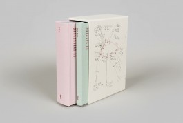
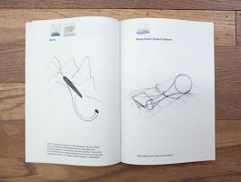
Design for the first ever publication of photographs by Anish Kapoor, the two volumes (752 pages altogether), published by Steidl, trace the artist’s journey through the religious sites of Uluru and Kata Tjuta in the Northern Territory of Australia. Designed as ‘silent’ publications but for Kapoor’s quotes on the front covers, and co-edited with Anish Kapoor Studio, the 362 images follow Kapoor’s gaze capturing his interest in form and pre-form, skin and surface that is present in his sculptural work. (Photographs ©Steidl)
Vitra Design Museum: Alexander Girard – A Designer’s Universe
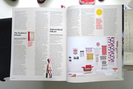
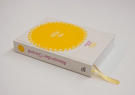
Design of a catalogue/monograph for “Alexander Girard: A Designer’s Universe”, a travelling exhibition which opened at the Vitra Design Museum in Germany in 2016. The 512-page publication is the first Girard book to extensively discuss the designer’s career and legacy, with six essays, a biography and an illustrated list of works with many previously unpublished material; a real treasure for Girard fans and researchers. Although we knew that the sheer amount of content would lend a certain gravitas to this publication, we didn’t want it to feel too dry or academic, and wanted the design to do justice to the work. We also wanted readers to get a sense of the work and the person before starting to read, so after going through the vast archives of folk objects, textiles, works and family photographs, we created a 120-page visual essay titled ‘Connections’ which served as the introduction to the book. When you publish old material it is often viewed nostalgically as something ‘retro’ and isn’t appreciated for what it truly is. We wanted to make sure that this didn’t happen, and that our book was engaging to a contemporary audience. We brought back the faded colours in the textiles, and introduced a sense of play to the juxtaposition of the images, in a way we felt was true to the spirit of Girard’s playfulness and sense of humour. The book was published in a German and English edition.
Stamps
Since 2003 we have been asked twelve times by the Bundesfinanzministerium (Referat Postwertzeichen) to invited stamp competitions. So far we got one 3rd place (for the stamp we designed for the ‘100th birthday of politician Annemarie Renger’ in 2018 and two 2nd places for the stamps we designed for the ‘Biathlon World Championships in Ruhpolding’ in 2012 and the stamp for ‘Das Grüne Band Deutschland (The Green Belt Germany)’ in 2019. In January 2019 our first stamp who won 1st place was published on the topic of ‘100 Years Frauenwahlrecht’ (Women’s suffrage) – please see extra feature below. Other stamp design proposals we did were on the topic of ‘Valentine’s Day’, ‘500 Years of German purity law for beer’, ‘First official postal flight in Germany’, ‘100 Years of Volkshochschule (adult evening classes) and ‘Foootball Euro 2020’.
Anish Kapoor — Website
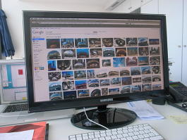
Concept, design and programming for the website of artist Anish Kapoor – live online since 2008 (Visit here). An ever growing chronological list of links to works, videos, texts, studio photographs, sketchbook drawings, or any other relevant page sourced from the web (including a Cloud Gate google for the much photographed sculpture in Chicago), the site has been kept simple yet is extremely dense: a site you can really get lost in.
I used to be a design student – 50 graphic designers then + now
The book we authored, edited and designed was published in February 2013 by Laurence King Publishing in London. It looks at the process a designer goes through in finding their ‘voice’. We asked fifty graphic designers to give us the low-down about their student days and their professional lives. A piece of their college work is shown alongside an example of current work. Each designer also offers a key piece of advice and a warning. Topics addressed include how ideas are researched and developed; design and other cultural influences, then and now; positive and negative aspects of working as a designer; motivations for becoming a designer; and whether it’s really possible to teach design. Awarded a Bronze Nail at the ADC (Art Directors Club) für Deutschland and a Certificate of Typographic Excellence at the TDC (Type Directors Club) in New York. Reviews on eye Magazine, Brain Pickings, It’s Nice That, Fast Company Design and other places. Order online at Laurence King, amazon.co.uk, amazon.com, amazon.de. In 2014 a Korean edition of the book was published by ag books and in 2016 a Chinese edition was published by HuaZhong University of Science & Technology Press. Contributions From Andreas Gnass (U9 Visuelle Allianz), Andrew Stevens (Graphic Thought Facility), Annelys De Vet, António S. Gomes (Barbara Says…), Ben Branagan, Bernd Hilpert (Unit-Design), Brian Webb, Christian Heusser (Equipo), Daniel Eatock, Danijela Djokic (Projekttriangle), Emmi Salonen (Studio Emmi), Éric & Marie Gaspar (Éricandmarie), Fons Hickmann (Fons Hickmann M23), Hans Dieter Reichert (Hdr Visual Coomunication), Holger Jacobs (Mind Design), Hoon Kim (Why Not Smile), Hyoun Youl Joe (Hey Joe), Isabelle Swiderski (Seven25), James Goggin (Museum Of Contemporary Art, Chicago), Jan Wilker (Karlssonwilker), Julie Gayard (Jutojo), Kai Von Rabenau (Mono.Graphie), Ken Garland, Kirsty Carter (A Practice For Everyday Life), Kristine Matthews (Studio Matthews), Lars Harmsen (Magma Brand Design), Laurent Lacour (Hauser Lacour), Liza Enebis (Studio Dumbar), Lucinda Newton-Dunn (Space-To-Think), Maki Suzuki (Åbäke), Marc Van Der Heijde (Studio Dumbar), Margaret Calvert, Marion Fink, Martin Lorenz (Twopoints.Net), Matthias Görlich (Studio Matthias Görlich), Michael Georgiou (G Design Studio), Nikki Gonnissen (Thonik), Oliver Klimpel (Büro International), Paul Barnes, Prem Krishnamurthy (Projects Projects), Renata Graw (Plural), Richard Walker (Kk Outlet/Kesselskramer), Sandra Hoffmann Robbiani (Visual Studies) , Sascha Lobe (L2m3), Stefan Sagmeister (Sagmeister Inc.), Sven Voelker (Sven Voelker Studio), Tim Balaam (Hyperkit), Urs Lehni (Lehni-Trüb, Rollo Press), Yasmin Khan (Counterspace), Yves Fidalgo (Fulguro).
Zumtobel annual report
Art direction and design of the 2011/12 annual report of lighting company Zumtobel. The design separated the report into two distinct volumes: a purely typographical, black and white book with the annual facts and figures typeset entirely in 8pt Courier, alongside a ‘silent’ publication of pure colour, a translation into print of the 1998 video work ‘Wounds and Absent Objects’ by Anish Kapoor. Reviewed at It’s Nice That, the Creative Review blog and Co.Design, the report was selected for the Designs of the Year 2013 awards at the Design Museum in London, nominated at Tokyo TDC and awarded a Gold Cube at the 92nd annual ADC Art Directors Club Global Awards in the US. Furthermore, it received a Golden Nail at the ADC für Deutschland awards and a Yellow Pencil at the D&AD Awards.
Endless Journey
Art direction, design and production of Tom Gauld’s ‘Endless Journey’ – a myriorama inspired by the works of Laurence Sterne. The pack consists of twelve picture cards that can be arranged to form 479,001,600 different landscapes. It was commissioned by The Laurence Sterne Trust with support by the Arts Council England on the occasion of the ‘Sentimental Landscapes’ exhibition at the Shandy Hall Museum in North Yorkshire. You can buy ‘Endless Journey’ here, and read more about it on It’s Nice That. Awarded with a pencil at the D&AD Awards.
Stamp Design – 100 Jahre Frauenwahlrecht (100 Years Women’s Suffrage in Germany)
The stamp and the first day cover stamps for 100 Jahre Frauenwahlrecht. The historical image, in conjunction with the typography, reflects the struggle for equality of women at the end of the 18th and beginning of the 19th century (until today). An example of this struggle is Marie Juchacz, the first speaker in front of a German parliament, after women’s suffrage was won. The photo shows her in 1919 during a speech in front of a crowd in Berlin. The typographical treatment serves also as a reference and hommage to the contemporary American (feminist) artist Barbara Kruger, and to Aleksander Rodchenko, the Russian artist, sculptor, photographer and graphic designer who played a vital role during the Russian October Revolution in 1917 which had a great influence on the German November Revolution in 1918, which finally brought the women right to vote to Germany.
Architektur Stadt Münster
Logo for an organisation that promotes architectural events (talks, exhibitions, walks) in the city of Münster, Germany. The shape combines the three dimensional nature of architecture and the ‘show off’ aspects of marketing.
Teaching in Darmstadt and London
We are teaching Graphic Design since 1998. Frank has been teaching Graphic Design since 1999. First as a visiting lecturer at various colleges in the UK and Germany, amongst them Kingston University, Brighton University and Merz-Akademie Stuttgart. Since 2007 he is a professor at the Faculty of Design at Darmstadt University. For student projects and information click here. Billy is an associate lecturer at UAL Camberwell College of Arts (UK) since 2014.
Martin Gropius Bau – Symphony for a Beloved Sun Anish Kapoor
Art direction and design of ‘Symphony for a Beloved Sun’, published on the occasion of ‘ Kapoor in Berlin’, a major solo exhibition by artist Anish Kapoor at the Martin-Gropius-Bau in Berlin. The design anticipates the tension created by bringing contemporary artworks into the classical environment of the Martin-Gropius-Bau. The generously-sized, classical catalogue was stained with red oil paint, given a red cut to the edge, and sewn with a red thread. Maintaining the strict classical grid for all text and images meant that large-scale works stretched across two pages to get the space they needed. Bold lists of work titles served as chapter dividers within the plates section. The 272-page book contains essays by Norman Rosenthal, Horst Bredekamp and Barbara Segelken. Reviewed on It’s Nice That and the Creative Review Blog. Grand Prix winner at the Tokyo TDC Awards 2014, Silver Cube winner at the 93rd annual ADC Art Directors Club Global Awards, nominated for a Yellow Pencil at the D&AD Awards and shortlisted for the Most Beautiful Book Award in Germany.
Darmstadt university lecture series Posters
Poster design for a lecture series at the University of Darmstadt by practitioners who have more than one practice. Playing on the saying ‘A bird never flew on one wing’ the design split the announcement down the middle, also accommodating for a bi-lingual, English/German poster. Sara de Bondt (Designer/Publisher), Kai von Rabenau (Photographer/Editor) and Christoph Keller (Curator/Choice Fruit Distiller) were among the speakers. Awarded at the TDC Type Directors Club Tokyo.
Business to Arts (B to A) visual identity incl. logo and literature
Visual identity for Business to Arts, a Dublin-based organisation facilitating creative partnerships between businesses and the arts. For the logo we wanted to create a mark that was both playful and serious and could happily sit in either a corporate or artistic environment. We merged the initials ‘A’ and ‘B’ in a single ligature, a solution that was bold, simple and anticipated the ‘rough’ treatment the logo may endure in the hands of third parties. Each year, Ireland’s best collaborations between business and the arts are celebrated in an award ceremony. We designed the winner’s brochure for the 2008, 2009 and 2010 Allianz Business to Arts Awards as well as all the other literature for the organization. The design for Business to Arts was awarded at the TDC Type Directors Club Tokyo.
Empathy Museum
Exhibition signage and everything graphic design for the exhibitions and events ‘A Mile in my Shoes’, ‘A Thousand and one Books’ and ‘Everything must go’ by the curator Clare Patey. ‘A Mile in my Shoes’ and ‘A Thousand and one Books’ were organized by the ‘Empathy Museum’.
KBNK Architects Website
Website design of www.kbnk.de for Hamburg-based kbnk Architects. The driving idea was to give the viewer control over the way in which the site is viewed. Case studies can be sorted by type of building, chronology, height, size, cost, or even colour adding a more playful note to the navigation. All images stretch to fit the browser window to use the available space efficiently, while a click on the logo takes this idea further by dropping all navigation entirely.
Bell Helicopter: Blade (CD)
Illustration and design for Bell Helicopter’s CD, Blade. The illustrations play on the album’s title by using a series of helicopter blade diagrams. Bell Helicopter is the musical playfield of artist Conor Kelly.
Frieze Magazine
Design, layout and promotional material for frieze d/e, a bilingual German/English magazine by the publishers of frieze, the international contemporary art and culture magazine. With editing and production based in Berlin, the magazine is published four times a year and offers in-depth coverage of contemporary art and culture throughout Germany, Austria and Switzerland, closely following the international artist communities in this region.
I have nothing to say
Design for a book of interviews with Anish Kapoor for RMN Grandpalais, France. Using an often-quoted statement by the artist for the front cover, we designed the book as a bi-lingual (French/English) edition with two separate front covers. Winner at the Annual Type Director’s Club awards and exhibition 2012, and featured in Typography 33.
Second Hand Records Stuttgart
Visual identity for one of the best and biggest second hand record stores in Germany including stationery, posters, flyer, bags and signage.
Chez Vous visual identity
Development of a visual identity, stationery and promotional literature for Chez Vous, a complete home dining experience in Athens created by French chef Tony Mordelet and hospitality professional Eirene Kollintza. Our design plays with the idea of cooking as an art that brings different ingredients together. Awarded at the TDC Type Directors Club Tokyo Awards and ΕΒΓΕ (Greek Graphic Design and Illustration) Awards.
L’Équipe magazine
Cover design for L’Équipe magazine, the supplement to France’s largest daily newspaper devoted to sports. Published on July 28, 2012, the issue was dedicated to the London Olympics, and Anish Kapoor was asked to design a special artist cover for the occasion. Working in collaboration with the artist, we developed a 3-D pop-up cover of a self-standing form, a 1:1100 ratio model inspired by Orbit at the Olympic Park in London.
Victor & Susie
Victor had broken his shell. So, armed with love and a steady supply of lettuce, Susie decided to nurse him back to health. —A story about caring, mending and letting-go drawn with letters and punctuation marks. A self-publication by Brighten the Corners, awarded at the TDC Type Directors Club Tokyo awards. and reviewed in Creative Review Blog + cool hunting + Designer’s Review of Books. Featured in drawn! + Made & Sold + Selected A + Tokyo TDC Vol 20.
Italian Cultural Institute — Programme
Series design for the Italian Cultural Institute’s programme of events for the duration of four years. To contrast the entirely typographic bulk of the programme, we used the introductory pages as a gallery of images by writer/photographer Dave Foster. Further Italian touches include a generously sized serif typeface for the copy, Latin numerals for pagination, and an elegant pocket-sized format. Awarded at the D&AD Awards and the ADC Art Directors Club Global Awards. Featured In Materials Process Print + Art Directors Annual + D&AD Annual.
Leviathan
Catalogue design for RMN Grandpalais of the Leviathan exhibition by Anish Kapoor for Monumenta 2011. Two hundred black and white pages of drawings, gouaches, architectural models, studio photographs, and writing lifted out of the artist’s sketchbooks, formed the bulk of the catalogue and traced the preparatory work and idea development process. The final pages of the book were used for the full colour photographs of the installed work within the Nave of the Grand Palais in Paris.
Inbox – 10 Years of Brighten the Corners
In 2008, we collected the most positive, the most negative and the weirdest Emails we received from our clients during 10 years in business and created a series of three posters to celebrate our 10th anniversary with them.
Up & Down the Pyranees
For 64 days, during summer 2011, a group of hikers travelled the entire length of the High Route Pyrenees, some 900km in total. Photographer Tim Mitchell joined the journey between Lescun and Gavarnie documenting moments at different altitudes. Clouds, distant walkers, a tent, a dead cow, a tiny flower, and, at the highest summit, some graffiti. We designed the collection of resulting photographs as ‘Up and down the Pyrenees’, using the various levels of altitude as steps in the layout. Printed in an edition of 100 copies.
Italian Cultural Institute Programme
Series redesign for the Italian Cultural Institute’s programme of events. We collected popular Italian sayings and printed them in letterpress with Ian Gabb. For each issue, the director pulled a saying out of a bowl to use for the programme’s wrap-around poster/cover (see below). To contrast the colourful outside, we designed the content as a purely typographic black programme, complete with matching staples. The posters were featured in an article on poster design in The Times.
Stone
Design of ‘Anish Kapoor: Stone’ the first comprehensive collection of the artist’s stone sculptures, dating from the 1980s to the present. The volume was designed as a ‘naked’ 352-page book block, to be extracted from its slip case. Front and back views of works are included where available, on the reverse of pages. The book was published on the occasion Anish Kapoor’s exhibition at the Sakıp Sabancı Museum in Istanbul and includes essays from Norman Rosenthal, Ahu Antmen, Halil Berktay, and an interview with Homi Bhabha and Anish Kapoor. Bronze Cube winner at the 93rd annual ADC Art Directors Club Global Awards.
Giant Writing Paper
Self-initiated, limited Edition, offset, single colour, size: 500×707mm (B2)
In the shadow of the tree and the knot of the earth
Catalogue design for Anish Kapoor’s exhibition ‘In the shadow of the tree and the knot of the earth’ at the Lisson Gallery in London. Instead of representing the sculptures in a traditional way, the artist’s drawings (absent from the exhibition itself) are used to set the mood for the publication. The dark and atmospheric drawings form the main content of the 320-page book, preempting the forms present in the exhibition space, which emerge as loosely inserted, full-colour photographs of the work. (Winner at the D&AD Awards 2013)
Giant Writing Paper
Self-initiated, limited Edition, offset, single colour, size: 500×707mm (B2)
Stone
Design of ‘Anish Kapoor: Stone’ the first comprehensive collection of the artist’s stone sculptures, dating from the 1980s to the present. The volume was designed as a ‘naked’ 352-page book block, to be extracted from its slip case. Front and back views of works are included where available, on the reverse of pages. The book was published on the occasion Anish Kapoor’s exhibition at the Sakıp Sabancı Museum in Istanbul and includes essays from Norman Rosenthal, Ahu Antmen, Halil Berktay, and an interview with Homi Bhabha and Anish Kapoor. Bronze Cube winner at the 93rd annual ADC Art Directors Club Global Awards.
April 2021
We have moved the news section of this website to Instagram. If you want to get information on our latest projects (and also on some past ones) please go to our new Instagram channel!
December 2020
We are very happy to see our website design for From Where I’m Standing (the latest project by Empathy Museum) go live this week. 34 people across the UK, ranging from a midwife and a supermarket worker to an undertaker and an anaesthetist were asked to choose an object that has been important to them during lockdown and talk about their experience. The resulting website contains their portraits and stories. The launch will also coincide with a physical exhibition on Dalberg Road in Brixton from Thursday 10th December.
December 2020
Kleinodien — 6 museums by 6 students of Frank at Darmstadt college (Fachbereich Gestaltung, Hochschule Darmstadt) produced over a period of 10 days in October 2020. Here the link to the museum website.
December 2020
Designers are often expected to make things “beautiful” but what does this mean and who decides anyway? Can beauty be an objective in itself, or is the design process informed by something else entirely? This Wednesday 2nd December Billy will give a talk at Central Saint Martins (D102D at 5pm) in which he considers how a similar design process followed in projects for the same client (Anish Kapoor) has lead to very different outcomes – some of which you might even call beautiful.
November 2020
Lots of things in the pipeline but nothing out quite yet… we are currently working on a new website and identity for architectural practice Studio Syn; a publication to accompany Anish Kapoor’s exhibition of paintings at Modern Art Oxford; a soon-to-go-live website for Empathy Museum’s latest project (and travelling exhibition) ‘From Where I’m Standing’; and a book considering the role of method in architecture edited by Jan Silberberger to be published by gta Zürich. We also won another stamp design competition by the German Post Office / Bundesfinanzministerium. The stamp will be published in June 2021. More information on that to come soon.
June 2020
Many things have happened since and before April 2017 (see also our news features below from April 2019, December 2016 and October 2014) when we handed over our files of ‘Uluru and Kata Tjuta Photographs’ by Anish Kapoor to Steidl publishers in Göttingen. One of these many things is that it went into production and is finally out to see in the flesh (more info here). And that’s not all. Another Steidl publication (1188 pages) is due out this September. More info when it exists…
May 2020
We have recently designed the visual identity and website for Same River (formerly Boz Temple-Morris), a company offering storytelling for a wide range of organisations including Accenture, Microsoft, Lenovo and BBC. For more information visit www.sameriver.co.uk
May 2020
Two blogs for courses Frank runs at Darmstadt college (Fachbereich Gestaltung, Hochschule Darmstadt) in the Corona summer semester 2020: www.letsplay.brightenthecorners.com, www.turnturnturn.brightenthecorners.com
April 2020
Our mini website for fashion historian, author and lecturer Elizabeth Kutesko has just gone live. Visit elizabethkutesko.com for more.
February 2020
Since last week we have been working on the marketing material for the upcoming Anish Kapoor exhibition at Houghton Hall which runs from March 29 to September 27. The graphic identity plays with the presence of Anish Kapoor’s mirrors in the house’s Stone Hall and will include magazine ads, billboards, leaflets and the exhibition booklet. Due to the fast approaching publication deadlines, the first ad was already sent out this morning.
February 2020
We designed a small collection of Guardian cartoons by Tom Gauld. It is a postcard-size booklet, twenty-four pages, stapled. You can buy it here.
February 2020
‘Sabotage and Tradition’, the CD we designed for Lakvar (contemporary folk music from eastern Europe), is out. The release concert and party is on the 27th of February in the Laboratorium in Stuttgart.
November 2019
‘Product’, the book we designed for Tim Mitchell and which was published by Kerber has made it on the shortlist of the German Photobook Award 2019.
September 2019
Flyer-poster-programme for a joint venture between the 3 theatres Staatstheater Darmstadt, Mousonturm Frankfurt and the Alte Oper Frankfurt on the topic of heroes (or rather the end of them…).
August 2019
After much digital (and analogue) editing, we have sent the 360-page photographic publication ‘Product’ to print. The book, published by Kerber, is the first monograph of photographer Tim Mitchell, and will accompany his exhibition at the Northern Gallery for Contemporary Art from 31 August to 9 November 2019.
June 2019
Gloria – design of posters, flyer, tickets, etc. for a choir concert with music by Vivaldi, Pergolesi and Rutter in two different churches (St. Johannes der Täufer and St. Stephanus) near the city of Obernburg am Main in Bavaria in October 2019.
May 2019
Our typographic stamp design for ‘Das Grüne Band Deutschland’ won 2nd place in the invited competition by the Bundesfinanzministerium (Referat Postwertzeichen). We are being invited to competitions since 2003. For more information and images see also our portfolio of work.
April 2019
A new job for an old client (designed from our very new studio in Deptford). The latest DAAD/IMLR German Writing Competition 2019, is inspired by the love letters of Queen Victoria and her husband Albert. The deadline for submission is Wednesday, 15 May 2019. More information on the competition here.
April 2019
After a mere 8 years (see also our news entry further down from October 2014) in the making (and a considerable amount of colour proofing), it seems that our epic, 1,184 pages of Anish Kapoor’s architectural drawings, models, renders, plans, and photos of the final works inlcuding their installation may be printed, bound and sent to bookshops in time for the summer. More information on the two-volume publication, ‘Make New Space – Architectural Projects by Anish Kapoor’, can be found on the publisher’s website, Steidl.
April 2019
After a mere 5 years (see also our news entry further down from October 2014) in the making (and a considerable amount of colour proofing), it seems that our epic, 752 pages of Anish Kapoor’s photographs from Uluru and Kata Tjuta may be printed, bound and sent to bookshops in time for the summer. More information on the two-volume publication, ‘Uluru & Kata Tjuta photographs by Anish Kapoor’, can be found on the publisher’s website, Steidl.
February 2019
Just in time for the closing of the exhibition of Anish Kapoor at the Serralves museum on February 17th in Porto, Portugal (yes, the show were a man was injured during an ‘art accident’) we finally have the printed catalogue we designed in the spring/summer of 2018 in our hands (on our chairs). We don’t really know what took the printer so long, nor do we know why the catalogue isn’t anywhere in shops yet. But we do know, that the special thing about this catalogue is, that it gives a very close insight in the way Anish Kapoor works in his studio, starting in 1975 up to 2018.
January 2019
We designed the stamp and the first day cover stamps for 100 Jahre Frauenwahlrecht (100 Years Women’s Suffrage in Germany). The historical image, in conjunction with the typography, reflects the struggle for equality of women at the end of the 18th and beginning of the 19th century (until today). An example of this struggle is Marie Juchacz, the first speaker in front of a German parliament, after women’s suffrage was won. The photo shows her in 1919 during a speech in front of a crowd in Berlin. The typographical treatment serves also as a reference and hommage to the contemporary American (feminist) artist Barbara Kruger, and to Aleksander Rodchenko, the Russian artist, sculptor, photographer and graphic designer who played a vital role during the Russian October Revolution in 1917 which had a great influence on the German November Revolution in 1918, which finally brought the women right to vote to Germany. Buy the stamp here.
November 2018
We designed the poster (A1, offset) for the regular High Noon talks at the Faculty of Design (FbG) in Darmstadt. The topic during this winter season is ‘FbG design partnerships’. The first talk with Riso Club from Leipzig (Christiane Haas & Sina Schindler, faculty alumna from 2013) is on the 4th of December and the second talk with Aether-Design from Heidelberg (Lukas Breitkreuz & Max Hathaway, faculty alumni from 2008) is on the 18th December 2018.
November 2018
Our stamp design for ‘Annemarie Renger 1919–2008’ won 3rd place in the invited competition by the Bundesfinanzministerium (Referat Postwertzeichen). We are being invited to competitions since 2003. For more information and images see also our portfolio of work.
November 2018
(Animated and printed) posters and flyers Frank’s students (Marvin Backes, Yannik Gedaschke, Alexander Kueller, Yannic Merz, Janik Sam) in Darmstadt designed for the High Noon talk of Raw Color (NL) on November 7th at the Faculty of Design.
Oktober 2018
Micro website for Sybille Philippin, mezzo-soprano – an opera and concert singer.
Oktober 2018
Visual Identity incl. logo and name for Milan-based Ksenia Emelianova, a Russian-born artist and interior designer. Micro-website to follow soon.
Oktober 2018
New micro website for ‘High Noon’ – a series of talks Frank organises at the Faculty of Design at Darmstadt University since 2008.
Oktober 2018
We have a new website. It’s our 5th site since we started the studio in 1999. If you are interested in the past you can click on the following links to see our first website from the year 2001–2004, our second one from 2005–2009, our third from 2010–2015 and our fourth from 2016–2018. Our new site is running on WordPress with Lay Theme and is our first site (apart from our very first site) were we haven’t used a programmer but do it all ourselves…
August 2018
The German studio of Brighten the Corners moved to the center of the Bavarian city of Aschaffenburg – close to Frankfurt/Main. Please go to our Info page for the full address.
August 2018
Our most recent book for Anish Kapoor’s exhibition in Serralves, Porto goes to print. All sections are printed except one – now, if we can only get a decision on those logo sizes on the cover and imprint pages… To see more work we have done for Anish Kapoor, please visit our portfolio.
This Tuesday, February 16th, Billy will be at JW3 (London Jewish Cultural Centre) to take part in ‘The Book is Dead! Long Live the Book!’ a discussion about changes in the publishing industry and how they are affecting the book as an object. He will be joined by artist Sophie Herxheimer, Hebrew calligrapher and Torah scribe Josh Baum, and graphic novelist Simone Lia who will talk to artist Jacqueline Nicholls about their work. You can book tickets here.
Frank just came back from Düsseldorf, where he was a guest-critic (looking and giving comments to over 100 (!) student works). He was invited by Andreas Uebele, who is teaching at the Peter Behrens School of Arts there. Frank also gave a talk at the end of a (very) long and enjoyable day. The event took place at the Filmwerkstatt Düsseldorf. The co-critics were Susanne Stahl from Berlin based studio Stahl R and Peter Zizka from Frankfurt/Berlin based Heine/Lenz/Zizka. (Photo: Jan Barthel)
We are very pleased to hear that our catalogue design for Anish Kapoor’s exhibition at the gardens of Versailles, has been awarded as Excellent Work at the 2016 Tokyo TDC (Type Directors Club) Awards in Japan.
A new bag for Second Hand Records store in Stuttgart for all who (still or came back to) love vinyl.
This week we went to Weil am Rhein for a meeting at the Vitra Design Museum. We are currently working for them on the catalogue for an exhibition about the life and work of Alexander Girard which will open in March 2016. Alexander Girard was an architect, interior designer, furniture designer, industrial designer, textile designer and graphic designer. He was also a collector of folk art. The show is the first major retrospective about his work and collection.
We have just returned from Russia, where we oversaw the production of ‘My Red Homeland’ the bi-lingual catalogue accompanying the exhibition of Anish Kapoor at the Jewish Museum & Tolerance Center in Moscow. The exhibition will run from the 22nd September 2015 until 17th Januray 2016.
The finishing touches have been applied, and ‘a Mile in my Shoes’ is now open to the public from today, 4 September until 27 September 2015. You can visit to hear strangers’ stories and walk in their shoes from 12.00 pm to 6.00 pm, Wednesday to Sunday, at Riverside Gardens, Nine Elms Lane, Vauxhall London SW8 2DU.
We have recently designed the identity of the world’s first Empathy Museum, and are currently working on the design for its launch event, ‘A Mile in my Shoes’. The event is an audio portrait of Wandsworth, housed in a theatrical shoe shop, where visitors literally walk in the shoes of a stranger. ‘A Mile in my Shoes’ is open 4–27 September 2015, 12.00 pm–6.00 pm, Wednesday to Sunday, at Riverside Gardens, Nine Elms Lane, Vauxhall London SW8 2DU.
Tom Gauld’s ‘Endless Journey’ a myriorama inspired by the works of Laurence Sterne, has just come back from the printers. The pack consists of twelve picture cards that can be arranged to form 479,001,600 different landscapes. It was commissioned by The Laurence Sterne Trust with support by Arts Council England on them occasion of the ‘Sentimental Landscapes’ exhibition at Shandy Hall in North Yorkshire. You can buy ‘Endless Journey’ here, and read more about it on It’s Nice That.
Frank will be giving a talk at Peter Behrens School of Arts in Düsseldorf on June 9th. Holger from mind design, who is teaching there, has invited us. Looking forward to seeing him and his students and to a hopefully nice day & night in Düsseldorf.
The latest poster we designed for Second Hand Records shop in Stuttgart is an A to Z of record covers. Each customer will get one for free when purchasing an item in the shop.
On International Labour Day May 1st we travelled out to Falmouth University in Cornwall to give a talk and tutorials to students in the The School of Communication Design.
We’re pleased to announce that on Thursday April 30th, we will be joining the ever growing list of speakers at the Typographic Circle. Our talk will start at 7:00pm at the St Bride Library, 14 Bride Lane, London EC4Y 8EQ. Previous speakers include Alan Kitching, Stefan Sagmeister, Ken Garland, Jonathan Barnbrook, and Simon Esterson among others. For a full list of speakers and an archive of their posters visit the Typographic Circle poster archive. To book tickets and for a glimpse of our poster please click here.
Brighten the Corners has been selected to be part of this year’s Book Design Jury during D&AD Judging Week 2015 at the Old Truman Brewery in East London. The Judging Week will feature a full programme of events and runs from 19 to 23 April. For more information, please click here.
Join the Club! Anah-Club, a website we designed for Berlin and Salzburg based Anah architects is online now. Thanks to Fabian Wohlfart for the coding.
It’s Nice That asked us for our favourite books on our bookshelves. We were happy to share this information with them (and now with you). Happy reading!
Lots of ink on good papers at the Stationers’ Hall in London for this year’s Fedrigoni Top Awards. We are also happy to have received second prize in the Books category for Symphony for a Beloved Sun. All winning work was on show between March 10–13, 2015.
We have just received the latest issue of Pulp, a quarterly journal created by Eye Magazine for Fedrigoni and designed by Holly Catford and Simon Esterson. It features an interview we had with John L Walters about our work for artist Anish Kapoor over the last few years. Follow this link to get your copy.
We are very happy that fig-2 has launched this week, for which we have designed the graphic identity and website www.fig2.co.uk. Many thanks to David Miller for the programming. fig-2 (organised in association with Outset) is a year-long exhibition featuring 50 projects over 50 weeks at the ICA Studio and is being curated by Art Fund curator, Fatoş Üstek. Week 1/50 featured artist Laura Eldret and was followed by a launch party at the ICA (see photograph by Sylvain Deleu). Week 2/50 opens on Monday 12 January with artist Charles Avery. More artists will be announced on a weekly basis, so keep checking the website as it grows.
This Thursday, November 27th is the opening of the exhibition ‘Marks and Traces’ in which the artist Kris Scholz presents his latest work. We have designed the poster and flyer for the show at the Designhaus/Alfred-Messel-Haus on the Mathildenhöhe in Darmstadt. The show will be open until January 11th.
Next week, on November 19th, the latest German-Polish Award will be presented to two organizations in Berlin. We have redesigned the award certificate which will be given to the winners in the name of the German and Polish governments. The prize has, in previous years, been given to individuals and organisations who have done good for the relationship between the two countries. Amongst them Willy Brandt, Tadeusz Mazowiecki, Richard von Weizsäcker and Lech Walesa.
We are currently working on a website for fig-2 (site launch on 5 December 2014), a revival of the seminal exhibition cycle fig-1, developed by Mark Francis and Jay Joplin in 2000. fig-2 will be a year-long exhibition held at The Studio, ICA and will feature a total of 50 projects in 50 weeks, opening with a new show each Monday evening. The event is curated by independent curator and writer Fatoş Üstek.
Slowly but steadily the visual identity we designed for Berlin and Salzburg based Anah architects is being implemented. After the website went online at the end of last year, the business cards have now been delivered to Berlin/Salzburg. More to come (sooner or later).
Books, books, books. 2014 has been a year of books. We are working on four new publications in total, but have a feeling they still have a way to go… updates to follow.
Great news from Germany, where our book, I used to be a design student – 50 graphic designers then + now was awarded a Bronze at the ADC (Art Directors Club) für Deutschland. Anish Kapoor – Symphony for a Beloved Sun was also nominated for a Yellow Pencil at this year’s D&AD Awards.
We recently designed several items for the 30th birthday of the Second Hand Records shop of our friends in Stuttgart. As well as flyers, stickers, buttons and vinyl lettering for the shop window we designed a ‘30 Year Record Poster’ featuring a favourite record for each of the last 30 years, as selected by the shop staff. Amongst them the fantastic ‘All shook down’ by ‘The Replacements’ as the best record of 1990, ‘Crooked Rain, Crooked Rain’ by ‘Pavement’ for 1994 and ‘Sometimes I wish we were an Eagle’ by ‘Bill Callahan’ for 2009.
The Korean edition of our book, ‘I used to be a design student’ published by ag books has just arrived in the post — a lovely sight! Also, good to see that our cover design survived a marketing process on the other side of the world!
Last week we flew to Tokyo to pick up the Grand Prix at the Tokyo TDC Awards 2014, attended the exhibition opening of the winning entries at the Ginza Graphic Gallery (ggg), and gave a talk during TDC Day. Thank you to our hosts – we had a great time out there!
ADC New York 2014 (ADC93): the design of the book ‘Anish Kapoor: Stone’ published by Sakip Sabanci Museum in Istanbul has won us a Bronze Cube, and the design of the book ‘Symphony for a Beloved Sun’ (Anish Kapoor) published by Walther König and the Martin Gropius-Bau in Berlin, a Silver Cube at this year’s ADC awards.
If you are in Tokyo between April 4–28, you can see our ‘Grand Prix’ winning work exhibited in this year’s Tokyo TDC Exhibition at the Ginza Graphic Gallery (ggg), DNP Ginza Bldg., 7-7-2 Ginza, Chuo-ku, Tokyo. The show is open between 11:00–19:00 (until 18:00 on Saturdays) and closed on Sundays and national holidays (admission is free). Also, on Saturday, April 5, between 12:30–18:30 we will giving a talk at the Design Forum TDC DAY, which will also include lectures and discussions by other Tokyo TDC Award winners and guests. The venue is the Joshibi University of Art and Design, Suginami Campus. For more information please visit: http://tdctokyo.org or email: info@tdctokyo.org.
‘ I used to be a design student – 50 graphic designers then + now’, the book we wrote, edited and designed, which was launched in February 2013 by Laurence King, has just been awarded with a ‘Certificate of Typographic Excellence’ by the The Type Directors Club New York 2014 (TDC60). From 2,000 entries from 43 countries, 209 from 18 countries were selected.
Our latest project, ‘A Fish Out of Water’, has just arrived back from the printers. The 24-page newspaper publication documents the mammoth task of the breaking of the RFA Grey Rover at Canada Docks, Liverpool during 2009 and 2011 through a sequence of jumbled-up images by photographer Tim Mitchell.
We are delighted to hear that our design of ‘Symphony for a Beloved Sun’ for Anish Kapoor’s major exhibition at the Martin-Gropius-Bau in Berlin has been awarded the Grand Prix at this year’s Tokyo TDC (Type Directors Club) Awards 2014 out of 2,958 entries. For more information visit the Walther König website .
The holding page we designed for Anah is now online. Anah is an architectural and landscaping practice based in Salzburg and soon in Berlin. It is also a magazine. For more answers about Anah, visit www.anah.eu.
Frank returned from a 10 day trip to China, were he gave talks and workshops at Chengdu Art College and at Xijing Art College in Xi’an. There were also a lot of calligraphy welcoming ceremonies and welcome dinners. I like Chinese!
We have just launched Eat the Soup, a website of photographs documenting Billy’s mental unravelling during the past six years. Visitors can follow his journeys chronologically by clicking on the dates, geographically by clicking on the locations, or thematically by clicking on the words silently spoken in his head. Thank you to Chris Brown for the programming.
There has been a lot of flying recently: Billy returned from Istanbul then flew to Parma to collect a Fedrigoni Top Award for our Zumtobel annual report 2011/12 at the wonderful Teatro Farnese. In the meantime, Frank is preparing for his first ever trip to China, where he will give talks and workshops at Chengdu Art College on October 28th and at Xijing Art College in Xi’an on November 1st.
Our newly designed website for Brixton-based Charles Barclay Architects www.cbarchitects.co.uk has recently gone online, and is slowly growing with more and more projects added daily. Avoiding the often over-complicated categorising in architect’s websites we decided instead to simply separate case studies into ‘Public’ or ‘Private’ categories. Visitors can therefore choose between the two, or browse both without a structure being imposed on them. Images are given prominence throughout the website, while further information and PDF case studies are visible by clicking the ‘Info’ button. Thank you to Simon French for the programming.
For the past two months we have been working on the design of ‘Anish Kapoor: Stone’ the first ever comprehensive collection of the artist’s stone works dating from the 1980s to the present day. The publication will accompany the opening of Anish Kapoor’ exhibition this Monday, September 9th at the Sakıp Sabancı Museum, Istanbul for which we have also designed the small catalogue. In the meantime, the proof reader has been pretty busy correcting the final, final, final proof.
To add to our Gold Cube (Art Directors Club USA) and Golden Nail (Art Directors Club Germany), we now have our very own Yellow Pencil from this year’s D&AD Awards (Design & Art Directors Club UK)! For a full list of the winners visit the Creative Review Blog.
Today, May 21st, Billy is giving a PechaKucha as part of ‘PechaKucha X Design’ at the Design Museum in London along with nominators and nominees from this year’s Designs of the Year 2013 exhibition. Other speakers include Patrick Bergel, Christophe Egret, Duncan Fitzsimons, Adrian Hon, Frith Kerr, Oliver Knight and Rory McGrath, David Kohn, Diogo Seixas Lopes, James Shaw, Pete Thomas, Matt Webb and Hal Watts.
Today, May 17th, the exhibition by Anish Kapoor (“Kapoor in Berlin”) opens in the Martin-Gropius-Bau. We designed the poster, invitation and flyer) as well as the bi-lingual exhibition catalogue “Symphony for a Beloved Sun” which is published by Verlag der Buchhandlung Walther König.
After winning a Golden Cube at the Art Directors Club in the US this year we have now won a Golden Nail from the Art Directors Club in Germany. What’s next – a Golden Cage? For other awards we have won this season read here.
We recently designed ‘Up and Down the Pyranees’, a 28-page booklet of images taken at various heights of the Pyranees mountain range by photographer Tim Mitchell. Images include a sign post, snow, a dead cow, and at the highest peak, some graffiti. The book will go on sale at the Westminster Reference Library, on Saturday 11 May 2013, 7.30–10.30pm, 35 St Martin’s Street, London WC2H 7HP, and at Tim’ website thereafter. More about the event here.
We are very happy to see our website for painter Clare Chapman, www.clarechapman.com, in the pipeline for quite some time now, finally up and running in all its glory! The design breaks down the painting caption into its component parts (title, year, size, materials) to use as the website navigation. Thank you to Chris Brown for the development.
We recently presented our new book, I used to be a design student , along with thoughts about our student and professional work at the University of Darmstadt in Germany where Frank is also professor of Graphic Design. Many thanks to the guest speakers and contributors to the book, Holger Jacobs from Mind Design, Liza Enebeis from Studio Dumbar and Matthias Görlich from Studio Matthias Goörlich who shared their work and insights into the happy and not-so-happy realities of being a designer.
It’s awards season (again)! Our design for the Zumtobel Annual Report has been awarded a Golden Cube at the 92nd Annual ADC Awards (Art Directors Club) in the US. For a full list of winners click here or for information on the selection process view the video below. Our report was also nominated as prize nominee work at the TDC Tokyo Awards (Type Directors Club), where our posters for the lecture series ‘A Bird Never Flew On One Wing’ was also selected as excellent work. The same posters also won at the TDC Awards New York (Type Directors Club). That’s all for now.
It’s been great to see our first ever book to hang on a wall at the Design Museum today, selected for the Design Museum Designs of the Year 2013 Awards. It was also good seeing plenty of copies of our new book ‘I used to be a design student’ at the Design Museum Shop. Whoever buys a copy gets a Zumtobel Annual thrown in for free. More information on the exhibition here.
Following the launch and presentation of our new book, ‘I used to be a design student’ at the Camberwell College of Arts we were invited to do a two-day workshop with the BA Graphic Design students there. Lots of great responses by the students, it was fun being back.
Lots of old friends and familiar faces at Monday’s launch of our new book ‘I used to be a design student’ at the Camberwell College of Arts. Thanks to everyone for coming, Richard Walker and Tim Balaam for talking, and a special thanks to Tracey Waller, Course Director for BA Graphic Design for her support and for helping organise the whole evening!
The time has come! On Monday, 18 February 2013, at 6pm we are returning to Camberwell College of Arts after 16 years for the launch of our book ‘I used to be a design student’ published by Laurence King. So please come along if you are free! From 6.30pm onwards we will talk about the concept behind the book and the 5 years it took us from first conceiving it to finally getting it in our hands. Richard Walker from KK Outlet and Tim Balaam from Hyperkit will then give us an insight into their student years (also at Camberwell) and what has happened in their professional lives since. This should all last approximately an hour; then there will be drinks. You will find more information on the book here and here. And here are ways of buying the book online. The full address for the launch is: Camberwell College of Arts, 1st floor, BA Graphic Design Studio, 45-65 Peckham Road, London SW5 8UF.
Happy New Year! Our annual report designed with Anish Kapoor for lighting company Zumtobel Group has been nominated for the Design Museum Designs of the Year 2013. You can read more about the shortlist at the Creative Review Blog. More information about the Designs of the Year exhibition to follow.
Last week we received an advance copy of ‘I used to be a design student’, the book we have been working on as authors, editors and designers for the past 2 years. Published by Laurence King and officially launching on February 18th 2013, it features the student and professional work (as well as past and current influences) of 50 graphic designers. Amongst them are Andrew Stevens (GTF), Daniel Eatock, Fons Hickmann, Holger Jacobs (Mind Design), James Goggin, Ken Garland, Kirsty Carter (APFEL), Liza Enebeis (Studio Dumbar), Maki Suzuki (Åbäke), Margaret Calvert, Paul Barnes, Prem Krishnamurthy (Projects Projects), Sascha Lobe (L2M3), Stefan Sagmeister, Urs Lehni. The book offers a rare chance to find out how graphic designers feel about their education and profession and gives the low-down about their student days and their professional lives. A piece of their college work is shown alongside an example of their current work. Each designer also offers a key piece of advice and a warning. The book looks at the process a designer goes through in finding their ‘voice’. Topics addressed include how ideas are researched and developed; design and other cultural influences, then and now; positive and negative aspects of working as a designer; motivations for becoming a designer; and whether it’s really possible to teach design. There will be an official book launch on February 18th 2013 at 6pm at Camberwell College of Arts in London, 1st floor, BA Graphic Design Studio, 45–65 Peckham Rd, London SE5 8UF. The German book launch will be on the 24th and 25th of April, 7pm at the faculty of design, Hochschule Darmstadt, Olbrichweg 10, 64287 Darmstadt, www.fbg.h-da.de. To buy the book online go to amazon.com, amazon.co.uk or amazon.de. More news to follow in February 2013.
Our latest catalogue for Anish Kapoor has just arrived from the printers. Printed on 60gsm paper, and bound as an asian fold, 448-page publication, ‘Anish Kapoor/Objects’ was published on the occasion of the artist’s second major solo exhibition in Asia at the Leeum, Samsung Museum of Art in Seoul, Korea. The design of the catalogue groups his artworks, models and sketches into distinct ‘object’ chapters: objects full of darkness, monochrome, non-objects, proto, internal, and auto-generated objects. Essays are by Tae Hyunsun, Lee Ufan, Joan Kee and Homi K. Bhabha.
We recently designed the publication to accompany Anish Kapoor’s exhibition of new works at Lisson Gallery in London. Entitled ‘In the Shadow of the Tree and the Knot of the Earth’ we designed the volume as a 320-page, black and white publication of the artist’s drawings with variously-sized, full-colour images of the new works inserted within.
The German half of Brighten the Corners has moved into the woods. Our new studio is in the Odenwald region near Darmstadt and Frankfurt. Click here for map and contact details.
It’s great to be the latest addition to the ever growing list of studio playlists at Studio Music (funny how you can find time to do certain things even when you are too busy…)
Since March, we have been working with Anish Kapoor on the 2012 Annual Report of lighting company Zumtobel, and the results have recently arrived from the printers. Taking his 1998 video work ‘Wounds and Absent Objects’ as a starting point, we separated the report into two separate volumes: a black & white, text-only volume containing all the facts and figures for the financial year, and a silent, colour-only publication, a graphic reinterpretation of the original video projection into print. To see the entire colour report click here or to order a copy click here and tick ‘Annual Report 2011/12 (available from July 27, 2012)’.
We have worked with artist Anish Kapoor on the design of a special 3D cover inspired by the Orbit for L’Équipe magazine. The issue, focussing on the London Olympics, is out on July 28, 2012.
Frank is currently curating ‘Halbfünf’, a series of talks at the Faculty of Design at the Hochschule Darmstadt were he also teaches. The topic of this series, ‘A bird never flew on one wing’, presents designers who do other things as well. The speakers and dates are: Christoph Keller (Editor, Book Designer, Curator and Choice Fruit Distiller), 22. May 2012. Kai von Rabenau (Photographer, Graphic Designer and Publisher, Editor, Label-Owner), 5. June 2012. Sara de Bondt (Graphic Designer and Publisher, Editor) 20. November 2012. Click here to find further information.
It’s been a pleasure watching our most colourful job to date going to press last week. A total of 10 (standard and bespoke) neon colours blending, overprinting and bleeding. The finished item is due in July…
In 2011 Frank took a 6-month sabbatical away from his responsibilities at Hochschule Darmstadt to research a topic he has always been interested in: design and attitude. During this time, he interviewed over 100 designers from all over the world, asking them professional and personal questions in equal measure and collecting examples of their student and professional work. We are delighted that the resulting book, is in the pipeline as a Laurence King publication to be released on 18th April 2013. More information to come…
We are currently working on the design for the annual report of international lighting solutions company Zumtobel. The report will be released this summer. More information to come soon.
The fourth issue of frieze d/e magazine (and the final to be art directed and designed by us) has been sent into the world, during a freezing week in Berlin…
We are winners in the Type Directors Club New York Competition 2012 (TDC58) in the category TDC Communication Design for the book and jacket ‘I have nothing to say’ – Interviews with Anish Kapoor. The winners will be featured in the book Typography 32 and in an exhibition in New York mid-year.
We have just finished working on the communication design for Everything Must Go, a three-day exhibition following the journeys of worn clothing as they are sold for reuse and recycling across the world. The show brings invisible global waste economies into public view, explores the people involved and the impact these businesses have upon their lives, and questions our ability to control, contain and curtail waste. It will be up for three days (20, 21, 22 January) a from 11am to 6pm at the Bargehouse at Oxo Tower Wharf in London, SE1 9PH.
The Tokyo Type Directors Club (TDC) has awarded us with an In-Book Award 2012 for a poster called Past Present Future for the DAAD in London.
Some of our (old) work has been featured in the new issue No. 16 of »Slanted – Bold Light«.
We recently returned from Berlin, where we completed the design for issue #3 of frieze d/e magazine. Billy wasn’t sure how smoothly it all went, but Frank was delighted! The moment was captured by Kai von Rabenau.
Two of our projects (Chez Vous Identity and DAAD Competition Posters 2010) are featured in Selected B, a publication series by Barcelona based publisher Index.
New studio, new year (almost), and a new visual identity. Our fluorescent stationery just arrived from the printers in Germany.
Quite a few projects have recently arrived from the printers: the newly designed DAAD Funding poster and booklet with study and research opportunities for 2012–2013, issue #2 of the new, bilingual frieze d/e magazine, as well as the latest Okido ‘Dirt’ issue. A microsite for the DAAD Competition ‘Past Present Future’ is also online.
We have just finished working on ‘Dirty Corner’ a publication of sketchbook drawings, paintings, architectural models, and sculptures by Anish Kapoor, dating from 1974 to the present and focusing on the consistent concern in the artist’s work with the void. We opted for a loose and simple approach to the layout, occasionally contrasting the dark and bloody subject matter with interruptions of light (Pantone yellow neon). ‘Dirty Corner’ will be published by Skira on the occasion of Kapoor’s exhibitions in Milan this year. (Distributed in the US, Canada, Central & South America by Rizzoli, and in the rest of the world, by Thames & Hudson).
After one year in the making we are really happy to announce the launch of the new website for Anish Kapoor with us having developed the concept, design and programming. It is a very simple, 2-level website, but with lots and lots of content. Simple but dense. Hope you enjoy it. We are very happy to see this site come to life!
We just came back from the opening of Leviathan, the latest enormous sculpture by Anish Kapoor in the Grand Palais during MONUMENTA in Paris. We have designed two books for this occasion: “I have nothing to say”, a 328 page pocket size bilingual (French/English) book with various interviews plus the 240 page exhibition catalogue “Leviathan”, showing mainly preparatory sketches, models and writing.
The latest poster for the yearly DAAD (German Academic Exchange Service) competition with this years title “Germany 2051 – What will it be like?” has just come back from the printers. We have been designing the competition material for the London office of the DAAD since 2008 now. In the background of the poster one can read the entire German history according to Wikipedia and set in 6pt Times. A microsite for the competition will go online in two weeks time.
Bye-Bye! We have just designed the last ever printed issue – No 18 – of the DAAD (German Academic Exchange Service) Newsletter. After having worked on this for the past 10 years (almost the entire life span of Brighten the Corners) it is time to say good bye. The next issue will be in an electronic format and so far we haven’t been asked to do this. So this is a double good bye…
We have just been designing the latest identity and call for entries for the Allianz Business to Art Awards 2011. This is the fourth year since it all came to life and it’s yet another play on the logo which we designed five years ago.
We have just returned from Berlin, where we finished the design for the first ever issue of frieze d/e (see also our News from November and March). The magazine is currently being printed, and launches on April 28th. (Photograph by Magdalena Magiera, frieze d/e, Berlin)
During this “awards season” we have had a few appreciations of our work, both for the studio and for the teaching we do. We have received the following awards: 100 Best Posters Award, Art Directors Club New York (Bronze in the category “Book Design/University Press Book”), Output 14 and ΕΒΓΕ 2011 (Greek Graphic Design & Illustration Awards – Visual Identity Commendation).
Conversations about Culture, a book containing the conversations about culture and the arts by people all over Ireland, has been published by Business to Arts, Dublin. Boz gathered all the material over a one-week period and we have designed the resulting book in collaboration with Ben Branagan. Photographs by Matthew Thompson.
We have been asked by Barcelona based design publisher Index Book to select work for a publication featuring interesting design projects completed during the past year. The name of the publication is Selected B. On top of that we gave a workshop with the title “Single Sentence Manifesto” during the Selected B Conference which took place from on the 25 & 25th of March in the Torre Agbar in Barcelona.
We have been working (see also our News from November) on the design for the launch of frieze d/e, a new quarterly art magazine hitting the newsstands in Germany, Austria and Switzerland this May. Some information from the official press release: ‘Frieze Publishing, the publishers of frieze the international contemporary art and culture magazine, is launching a new publication, frieze d/e, in Spring 2011. frieze d/e – a fully bilingual German/English quarterly – is a separate publication with its own editorial team and independent content. ‘d/e’ stands for ‘Deutsch’ and ‘English’. With editing and production based in Berlin, the new magazine will offer in-depth coverage of contemporary art and culture throughout Germany, Austria and Switzerland while closely following the international artist communities in this region.’ Full press release.
The Tokyo Type Directors Club (TDC) has awarded us with two In-Book Awards 2011. One in the category Mark & Logo/Corporate stationery for the work we have done for Athens based company Chez Vous. And another one in the category Poster for the work we have done for a screening of the film Kippenberger at Darmstadt University of Applied Sciences, Faculty of Design.
We designed the directional billboard ads in Stuttgart city centre and all graphics (vinyl signage, bags, posters and postcards) for the new store of Second Hand Records in Stuttgart. For more information on Second Hand Records click here.
The catalogue we designed for the Anish Kapoor India exhibitions in New Delhi and Mumbai has arrived from the printers. Published by the British Council and Lisson Gallery, the 220-page catalogue features a retrospective of Anish Kapoor’s work, and a gallery of his architectural models. It also includes a conversation with the exhibition curators, Andrea Rose and Greg Hilty, essays by Homi Bhabha and Nancy Adajania, and an extensive, illustrated chronology. We printed text pages on a tinted, uncoated stock, works on a coated, white stock and bound the catalogue with red thread and head/tail ends. All text was printed in red.
Opening night of the Anish Kapoor show at the Mehboob Film Studios in Mumbai. We designed a 38×18 metre banner of red wax from Shooting Into the Corner to cover the entire facade of the building. For more information about the exhibitions in Delhi and Mumbai and an interview with Anish Kapoor click one of these links.
We have been working on the design of a new bilingual (German/English) art magazine. A dummy has been designed and the publisher is presently exploring the market potential for such a release. Everything is confidential at the moment, more information to follow if everything goes ahead…
The bus shelter ads, billboards and posters we designed for the Anish Kapoor exhibition in India are going up in the streets of New Delhi and Mumbai. For press about the exhibitions click on these links.
This Friday and Saturday, 12th – 13th November, we are opening our drawers once again to sell our products at the Small Publishers Fair. We have a little stall together with Tom Gauld (see news below). The fair is open from 11am to 7pm each day and admission is free. The address is Conway Hall, Red Lion Square, London WC1.
We have just designed and produced the latest project — 12 Postcards – by Tom Gauld. More about Tom’s work.
We’ve been commissioned to develop the exhibition identity, marketing material, catalogue design and merchandise for Anish Kapoor’s first ever exhibition in India. Organised by the Ministry of Culture, Government of India, NGMA, British Council and Lisson Gallery , the exhibition will take place in two venues, the National Gallery of Modern Art in New Delhi (30.11.2010–16.01.2011), and the Mehboob Film Studios in Mumbai (28.11.2010–27.02.2011). More information to come soon.
It’s great to see our work featured in Selected A — Graphic Design from Across Europe, a selection of work produced by European creative studios during last year. Click here for more information about this publication.
The Complete Typographer — A Foundation Course for Graphic Designers Working with Type, written by Will Hill and featuring our work has just been published by Thames & Hudson. Click here for more information on this book.
We’re happy to see the latest ‘Body Noises’ issue of Okido back from the printers and in bookshops all over London (including its first appearance at WHSmith’s). We worked with Okido editor Sophie Dauvois in developing a redesign that communicates what this kids’ Arts & Science magazine is all about to a wider audience. Click here to buy this issue on the Okido website.
The ‘find Funding’ booklets and posters which we have been designing for the DAAD London (German Academic Exchange Service) for the last 4 years just came back from the printers.
We received this email today from Australia, we’re glad to see our posters traveling the globe! Hi Brighten the Corners, My friend bought me the Inbox prints for my birthday and got them shipped to Australia. I got them framed this week and I just wanted to pass on this photo to show you how rad they look. I just love them. Thank-you! Kind Regards, Tara.
We designed the logo and visual identity for KASAPI Hellas, an organisation based in Athens, dedicated to improving the lives of Philippine migrant workers in Greece. Drawing on the rich cultural heritage of the Philippines and the participatory nature of the organisation, we used a system of overlapping colours to develop illustrations and a set of different logos.
We recently designed the poster, invitation, programme, and winners’ brochure for the 2010 Allianz Business to Arts Awards, an annual event recognising collaboration and creativity in business and arts partnerships in Ireland. Click here to visit the Business to Arts website.
Pavement (the band) played Brixton Academy on May 13th, a few metres down the road from our studio.
We’ve contributed work and bold predictions about the future of Graphic Design to the latest issue of Idea magazine: Idea No. 340: Forms of Practice. Other contributors include APFEL, A2/SW/HK, Sara De Bondt studio, Anthony Burrill, Hyperkit, Mind Design, Music, James Goggin and others.
Show Down, 12 hours of conflict, is an exhibition with projections, sound, films and performances designed and organised by 22 students of the Faculty of Design, University of Applied Sciences Darmstadt (Germany). The exhibition was developed in a workshop Frank did with his students and in collaboration with Matthias Görlich and Jörg Stürzebecher.
“THANK YOU — YOU’VE MADE MY DAY! I don’t care anymore that I am not going on holiday! Many kisses.” Inbox, our anniversary poster set with incoming emails from the last ten years of our practise, was selected for The Creative Review Annual 2010.
D&AD Award 2010 (In-Book) in the category Book Design Typography for ‘3 Minutes’, a collection of ten diverse and extremely powerful 3-minute interviews about the effect of the Tibetan conflict. Our contribution to the collection was a typographical interpretation of a 3-minute interview with Tenzin Lose into a 16-page booklet. Other contributors to the project included Bibliotheque, Stefan Gandl (NeubauBerlin), Nick Hard (Research Studios), Jeff Knowles (Research Studios), Abbott Miller (Pentagram), and Un.titled. For more information about DAHRA (Designers Against Human Rights Abuse) or to buy the book click here. All proceeds go to the Tibet Relief Fund.
Eat the cow! Sauté the onion! We developed the logo, stationery, promotional literature and website for Chez Vous, a complete home dining experience in Athens created by French chef Tony Mordelet and hospitality professional Eirene Kollintza. Our design plays with the idea of cooking as an art that brings different elements together. For more information email info@chezvous.gr.
Bitte laßt die Blumen leben! (Please let the flowers live!) is a publication Frank and Matthias Görlich developed with students during a workshop at the Faculty of Design, University of Applied Sciences Darmstadt (Germany). The publication deals with the question of what is good, bad and ugly design and whether one can give answers of that kind.
We designed the invitation for ‘Version’ an exhibition featuring work of: Christina Christoforou by Yann Brien, Mark Oliver by Clayton Junior, Yann Brien by Mark Oliver, Clayton Junior by Mark Long, Gabriele Herzog by Christina Christoforou, and Mark Long by Gabriele Herzog. The private view is on Tuesday 9 March, 6pm, at Medcalf, 40 Exmouth Market, London Ec1R 4QE. The show ends on 30 April 2010.
The ‘Learn German’ concertina we designed for the Goethe-Institut London is going out to UK schools this month. Developed with parents and carers in mind, it outlines the commercial, professional and cultural benefits of learning German.
Our 3 books (“Victor & Susie”, “Stanley & Marvin”, “Susie & Edward”) which we wrote, illustrated, designed and produced have won a TDC Tokyo Type Directors Club In-Book Award 2010 in the category Experimental Work.
The posters and postcards we designed for the DAAD’s 2010 Loanword Competition just came back from the printers. The concept was based around the saying “Don’t give me that spiel”. Visually the posters and postcards refer to old bill posters.
Our compliment slip “edited” by 5 year old Gabriel – lovely. A happy new year to everyone!
In December we printed INBOX, three posters with a selection of our incoming emails from the past 10 years. Here are some of the email responses we received: Yay! Congratulations. 10 years! And your work still looks great! @ Absolutely love our post this morning… Fantastic! I think I recognise an email or two in there though… @ Die Geburtstagsposter sind gestern bei uns angekommen und haben heute morgen beim Frühstück für etliche Lacher gesorgt. Wir sind ein wenig neidisch, dass ihr es in 10 Jahren geschafft habt auch ein Poster mit Lob zu füllen. Respekt! @ Thank you for your posters! They are very nice. @ Thank you very much for your mail — I like the idea of an email-history over ten years, brilliant! Especially the slightly aggravated stuff is intriguing 😉 All the best to Brighten the Corners for the next ten years! @ Got the posters, they cheered our living room, thanks a lot! @ Vielelicht magst du uns ja auch bei den Reviews verlinken. Wenn du irgendetwas geändert haben möchtest, gib mir Bescheid. Ich finde die Idee echt klasse… ich finde, das ist ne sehr typische Arbeit von dir 🙂 @ Μόλις έλαβα τα ποστεράκια σας και η μέρα μου ξεκινάει με πολύ χαρά. @ Thanks for the posters — I love these, brilliant idea — in particular the red one ‘I am sorry but this poster…’ has a particular resonance for me. It’s going to take pride of place in my studio. @ I loved the celebratory posters. Good luck with the next ten years. @ Got the lovely posters at the RCA — thank you @ Billara! Just got your inbox posters. Thanks for sending. Excellent! Read some of them to my sister (she of the broadcast design company) and she was weeping and crying all at the same time. Very emotional. @ I received the posters on the last day I was in London actually. It’s a really nice idea, thank you for sending them over! Some of them are so absurd I was laughing all the time. @ Thanks for the lovely prints – they caused familiar sighs and chuckles all over the studio. @ Well you certainly gave us a good laugh. It is a shame if you have grown up, children usually behave better than adults… Glad to see we are not the only fussy ones. I can just imagine you saving these emails over the years. Congratulations on 10 years and all the very best for the future. @ Thanks, the posters are great! Nice to brighten up the corners of my office. @ Έφτασε ένα ωραίο πακετάκι με δύο μικρές φωτογραφίες της queen. Πόσο νέα δείχνει! My compliments. Έκανες ωραία δουλειά μεγάλε. Θα στολίσω το δωμάτιο του μπαμπά. @ Just got my set of posters — and am sitting at my desk laughing to the point of tears. Everyone in the office is looking a little concerned on my behalf. @ Just received my copy from the german partner. Spent half an hour reading and enjoying every one of the messages! Great stuff. @ Thanks so much for the set of posters that arrived today. Very nice surprise. A brilliant project — like it a lot. Saw them online on your new (and also nice) website and CR. Congrats all around! 8)
Brighten the Corners is ten years old. We’ve worked on a lot of projects during this time. And received many many emails, all of which played a part in how the projects turned out. So, to celebrate our tenth anniversary we’ve decided to give these daily exchanges a long overdue public platform. This is a representative selection, not just the positive or amusing ones, but also the bad, the confused, the dull and the ridiculous, each one an inseparable part of the design process.
Our new website is online since December 1st, just in time for our 10th anniversary. Our old website has served as well for 5 years. And although we were quite fond of it, we also needed change. Hip Hip Hurrah! Thanks to Stephan Barbe who programmed it.
Frank was invited to create a poster on the subject of “Common Threads”. The exhibition with the same title took place at the Emily Carr University in Vancouver and presented also posters amongst others by Albert Folch, Henrik Kubel, Hyperkit, Silke Klinnert, Simon Svärd.
In October we had a photo-shoot for all the pictures (250!) for our new website in a studio in Stuttgart. Photographer: Thomas Herrmann. Thanks to him and Kristin Schoch who helped doing the cut outs and retouching.
Close Up – 10 Years of European Design Projects by the Helen Hamlyn Research Associates at the Royal College of Art 1999–2009. 25 September – 6 October 2009 included work we have done for the Italian Cultural Institute in London.
We were invited to produce a 16 page booklet for “3 Minutes”. The premise of the book is to show the full extent of the Tibetan conflict through 10 diverse and extremely powerful 3-minute interviews, each describing the 3 minutes that changed their lives. All contributors were asked to translate these minute interviews into 16 printed page booklets using primarily typography. The result is a book made up of 10 booklets. The book is available for £10 with all proceeds going to Tibet Relief Fund and being distributed by Subism. Other contributors to this project are Bibliotheque, Stefan Gandl (NeubauBerlin), Nick Hard (Research Studios), Jeff Knowles (Research Studios), Abbott Miller (Pentagram), Un.titled.
DAAD UK Student Competition: we have designed the competition material for the DAAD’s ‘Create A Modern German Fairytale’ competition. Entrants can respond by any medium they choose. Click here to visit the site and for information on how to enter.
The website we designed for Stuttgart-based photographer Thomas Herrmann is now online.
For a letterpress poster we have designed to promote the screening of the film “Helvetica” at the Faculty of Design in Darmstadt we have been awarded with an Art Directors Club Germany Award in the category Typography.
A publication (“Farben on Demand”) which Frank and his students at the Faculty of Design in Darmstadt have done together with James Goggin from Practise has been awarded with an Art Directors Club New York (ADC) Cube Award 2009 in the category Book Design (Public Service/Non-Profit Book). The award was presented in New York and handed over to two of the participating students.
The Tokyo Type Directors Club (TDC) has selected the logo-work we have done for “Business to Arts”, an organisation based in Dublin, Ireland, for their Annual Awards 2009.
The website we designed for Hamburg-based kbnk Architects is now online.
We designed Traduttore, Traditore (Translator, Traitor) an A3 print for Issue 1 of Making Do magazine. The issue explores translation through various mediums and includes work by Christina Christoforou, Sonja Lau, Andreas Pisac, and Mary Ikoniadou among others. Click here for more information on the Translation Issue or here to visit the shop.
October 2008
We wrote, illustrated, designed and published a children’s book for adults – Victor & Susie. It will be in selcted shops from November 1st. The book can also be purchased directly through this website for £5/€7.
September 2008
We designed and produced 6 different notebooks with 6 different lined patterns and colours. Gold cut on the long right edge of each notebook and golden staples. Comes in a see-through bag. One notebook can be purchased for £3/€4. All six for £15/€20.
May 2008
We received two ADC Awards 2008 (Art Directors Club New York). One for the design of the programme for the Italian Cultural Institute in London and another one for the newsmagazine Accenture Ireland CCD 07.
March 2008
We recently designed the material (A1 poster and postcard concertina) for the DAAD (German Academic Exchange Service) competition. Deadline for entries is in November 2008.
May 2008
On the 14/5/08 we will give a talk to the 3rd year Graphic Design students at Camberwell College of Arts London. Camberwell college is where both of us, Billy and Frank, met and studied. We graduated there in 1997. It will be good and strange to be back. We are looking forward to it!
April 2008
On the 10/4/08 we will give a talk to the students at the Communication, Art and Design department at the Royal College of Art London.
January 2008
Design of a new programme of events for the Italian Cultural Institute in London. We asked the staff of the institute to collect their favourite Italian sayings, and used the cover of each issue as a fold-out poster to display them. Poster designed with Ian Gabb.